Monday, February 27, 2012

Fill up a WPF progress bar with a linear gradient

Not so long ago I was faced with a problem how to fill a rectangle with a gradient, which shows a progress, with the gradient stops depending on the current progress. I know I know, this probably tells you nothing. I believe a good visual example will save me a thousand words, so here it comes. This is what I wanted to say:
imageimageimage
So lets discuss what we see here. We have three styled progress bars, each filled with the same background. The middle one serves as a reference point only. The middle and the last text boxes are filled with a regular linear gradient brush. And I mean regular, absolutely no magic there. When we change the progress using the slider, you can see that the rectangle which is used to show current progress shrinks or expands, but the last gradient behaves in a weird way. This is actually the default bahavior here. However, what I really expect is the behavior of the first progress bar – the fill gradient depends on the current progress. In other words, you can imagine 100% as the full gradient. Than, I want to crop it based on current progress.

So how to write a custom brush which would do that ? Yes, yes, you’re right. It’s not possible. You cannot write custom brushes in WPF. That’s sad but it’s true. No luck ? No! Attached behavior comes to the rescue! Whenever progress changes the attached behavior will recreate LinearGradientBrush and recalculate gradient stops based on the original gradient. It’s actuall simple, let’s have a quick overview of the code itself.

public class LinearGradientBrushBehavior : Behavior<RangeBase>
{
    protected override void OnAttached()
    {            
        AssociatedObject.Loaded += AssociatedObject_Loaded;
        AssociatedObject.ValueChanged += AssociatedObject_ValueChanged;

        var sourceBrush = AssociatedObject.Foreground as LinearGradientBrush;
        if (sourceBrush != null)
        {
            SourceBrush = sourceBrush;
        }
    }
        
    protected override void OnDetaching()
    {
        AssociatedObject.Loaded -= AssociatedObject_Loaded;
        AssociatedObject.ValueChanged -= AssociatedObject_ValueChanged;
    }

    private void AssociatedObject_Loaded(object sender, RoutedEventArgs e)
    {
        CalculateNewGradient(Progress);
    }

    private void AssociatedObject_ValueChanged(object sender, RoutedPropertyChangedEventArgs<double> e)
    {
        CalculateNewGradient(Progress);
    }

    private double Progress
    {
        get { return AssociatedObject.Value / (AssociatedObject.Maximum - AssociatedObject.Minimum); }
    }

    #region SourceBrush

    public LinearGradientBrush SourceBrush
    {
        get { return (LinearGradientBrush)GetValue(SourceBrushProperty); }
        set { SetValue(SourceBrushProperty, value); }
    }

    public static readonly DependencyProperty SourceBrushProperty =
        DependencyProperty.Register(
            "SourceBrush", typeof(LinearGradientBrush), typeof(LinearGradientBrushBehavior), new UIPropertyMetadata(null));

    #endregion
        
    private void CalculateNewGradient(double progress)
    {
        var brush = new LinearGradientBrush();
        brush.StartPoint = SourceBrush.StartPoint;
        brush.EndPoint = SourceBrush.EndPoint;

        foreach (var gradientStop in SourceBrush.GradientStops)
        {
            var offset = (1 - gradientStop.Offset) / progress;
            var newGradientStop = new GradientStop(gradientStop.Color, 1 - offset);
            brush.GradientStops.Add(newGradientStop);
        }

        ApplyNewGradient(brush);
    }

    private void ApplyNewGradient(LinearGradientBrush brush)
    {
        AssociatedObject.Foreground = brush;
    }
}

The most important part is the CalculateNewGradient method, which is called once when the control loads up and each time the progress changes. That method is responsible for calculating new offsets for all gradient stops. Recalculated gradient is than reapplied to the Foreground property. I don’t have to add that rectangle’s Fill is bound to it :) It’s also worth pointing out that this behavior works with RangeBase inherited controls, so you can utilize it to create nice looking Slider!

One thing to consider here is performance. I haven’t noticed any problems, even though each time progress changes, new instance of LinearGradientBrush is created. Which is good :) You can find the sources on my SkyDrive. Hope you like it!

Wednesday, November 2, 2011

WPF transitions using pixel shaders and Blend SDK

WPF transitions are a very nice way to turn standard, boring application interactions into great user experiences, and show the author pays attention to details. There are basically two ways of implementing transitions in WPF. You can do a manual transition using RenderTransform to modify the visuals’ position, scaling and rotation. Throwing in an opacity animation would improve the effect. This option is talked more in-depth here. However, there is a couple of problems with this approach. The biggest issue is that such transitions are CPU bound, since the transition is calculated on the main processor. The other problem is more prosaic – they are relatively hard to implement. The other way is to utilize pixel shaders to blend between two visuals’ images making the illusion of transition. Transitions done this way are GFX bound, offloading the CPU which can perform other useful tasks. Besides, they look just awesome, as you shall see in a moment :) There is a small problem associated with this approach, though. To write custom pixel shader, some GFX knowledge accompanied by HLSL might be required. Crafting nice effect probably would also require a bit of math :) Thankfully, there are some nice libraries packed with effects ready to use! So no worries, we will not be talking math here!
In this post I will discuss how to build a TransitionControl, which beautifully animates transitions from one visual state into the other. To demonstrate the effect, I updated my wizard demo (discussed here and here) so that transitions between consecutive steps are nicely animated. I will also show what it takes to add transition effect to regular TabControl. The following screens show the slide transition between two wizard steps.
imageimageimage
And the following shows a transition within TabControl.
imageimageimage


Pixel shader libraries
Pixel shaders were introduced in .NET Framework 3.5 SP1. By this time, Microsoft released really cool library called WPF Effects Library. The library is composed of two types of components: effects and transitions. Effects are successors to well known bitmap effects, and provide a way to alter how a visual is rendered on the screen (see this video). Transitions, on the other hand, provide a means to.. transition from one visual state to the other. Easy, huh ? We will leverage them to build robust TransitionControl.
These days the project seems not to be much updated, the latest version is 2.0 beta which targets .NET 3.5, but works with .NET 4.0 and Visual Studio 2010. The good news is that although this project is not longer maintained, most of the effects and transitions made its way to Blend 4.0 SDK! They are available in Microsoft.Expression.Effects.dll assembly.
Okay, so I introduced transitions, just show how to use them and probably we’re done here, right ? it turns out we’re not quite done here. Lets see what is the API for using a transition effect. The base TransitionEffect class, from which all transitions derive, is located in Microsoft.Expression.Interactions.dll assembly, and its public API is defined as follows:
public abstract class TransitionEffect : ShaderEffect
{
    protected TransitionEffect();
    public Brush Input { get; set; }
    public Brush OldImage { get; set; }
    public double Progress { get; set; }
}
The class inherits ShaderEffect, which makes it essentially a regular pixel shader effect. So it can be assigned to the Effect property of any UIElement. There are also two important properties: OldImage and Progress. The OldImage brush defines the look of the old visual, and the Progress, between 0.0 and 1.0, denotes where we are within the transition. So the flow when using any TransitionEffect is as follows:
  1. Choose any transition effect and apply it to any UIElement which is the target visual we want to transition to
  2. Get the VisualBrush which depicts the visual we transition from, and assign it to the OldImage property
  3. Animate Progress property from 0.0 to 1.0 to perform the actual transition
As you can see, this is not very complicated, but far from being convenient. And this is where TransitionControl comes to play (I believe Telerik offers similar control).


Meet the TransitionControl
TransitionControl encapsulates the above three steps and provides a nice API to consume by the client. Let’s think for a moment, what is the most convenient API for the TransitionControl ? Yes, you’re right, it’s a ContentControl! ContentControl provides a Content property which is almost everything we care about. Whenever we change the Content property to something else, we expect to get a nice transition which smoothly goes from one visual state to the other. Having said that, let’s see the API of the TransitionControl.
public class TransitionControl : ContentControl
{    
    public TransitionSelector ContentTransitionSelector { get; set; }
    
    public TimeSpan Duration { get; set; }

    public IEasingFunction EasingFunction { get; set; }

    public bool EnableTransitions { get; set; }       
}
You can see that the TransitionControl is essentially a ContentControl. This is good, because, whenever you use ContentControl, you can swap it for TransitionControl and get the transitions for free! The second important thing is how actually TransitionControl knows about particular transition we want to use ? This is where TransitionSelector comes in. It is an abstract class which behaves similarly to DataTemplateSelector. It defines single method as show below.
public abstract class TransitionSelector
{
    public abstract TransitionEffect GetTransition(object oldContent, object newContent, DependencyObject container);
}
You implement this class and hand over a new instance to TransitionControl. You get both the old and new contents, so it is possible to write dynamic logic which selects transition based on a content. Nice, huh ? There are also two properties which drive the behavior of the transition. Duration determines the length of the transition, and EasingFunction allows to supply easing function :)


How does it work ?
The transition kicks of when the Content property changes. If the previous content was empty, of course no transition occurs. But if both old and new contents are presents, transition is triggered. The “magic” sits in the AnimateContent method, which is responsible for going through the three steps outlined previously.
private void AnimateContent(object oldContent, object newContent)
{
    var oldContentVisual = GetVisualChild();
    var tier = (RenderCapability.Tier >> 16);

    // if we dont have a selector, or the visual content is not a FE, do not animate
    if (EnableTransitions == false || ContentTransitionSelector == null || oldContentVisual == null || tier < 2)
    {
        SetNonVisualChild(newContent);
        return;
    }
    
    // create the transition
    TransitionEffect transitionEffect = ContentTransitionSelector.GetTransition(oldContent, newContent, this);
    if (transitionEffect == null)
    {
        throw new InvalidOperationException("Returned transition effect is null.");
    }

    // create the animation
    DoubleAnimation da = new DoubleAnimation(0.0, 1.0, new Duration(Duration), FillBehavior.HoldEnd);
    da.Completed += delegate
    {
        ApplyEffect(null);
    };
    if (EasingFunction != null)
    {
        da.EasingFunction = EasingFunction;
    }
    else
    {
        da.AccelerationRatio = 0.5;
        da.DecelerationRatio = 0.5;
    }
    transitionEffect.BeginAnimation(TransitionEffect.ProgressProperty, da);

    // create the visual brush which is the source of the "old content" image
    VisualBrush oldVisualBrush = new VisualBrush(oldContentVisual);
    transitionEffect.OldImage = oldVisualBrush;

    SetNonVisualChild(newContent);
    ApplyEffect(transitionEffect);
}


How to make transition aware TabControl
This task is super easy task! Just extract the default template for TabControl, and remove ContentPresenter with name PART_SelectedContentHost and provide the following XAML.
<Controls:TransitionControl 
  x:Name="PART_SelectedContentHost"
  Duration="00:00:01"
  Content="{TemplateBinding SelectedContent}"
  ContentTransitionSelector="{StaticResource TabControlTransitionSelectorKey}"
  Margin="{TemplateBinding Padding}" SnapsToDevicePixels="{TemplateBinding SnapsToDevicePixels}"/>

You will have to supply proper TransitionSelector. In the demo application, I used the following:
public class TabControlTransitionSelector : TransitionSelector
{
    private readonly Random _random = new Random();

    private readonly TransitionEffect[] _transitions = new TransitionEffect[]
    {
        new SmoothSwirlGridTransitionEffect(),
        new BlindsTransitionEffect(),
        new CircleRevealTransitionEffect(),
        new CloudRevealTransitionEffect(),
        new FadeTransitionEffect(),
        new PixelateTransitionEffect(),
        new RadialBlurTransitionEffect(),
        new RippleTransitionEffect(),
        new WaveTransitionEffect(),
        new WipeTransitionEffect(),
        new SlideInTransitionEffect { SlideDirection = SlideDirection.TopToBottom }
    };
    public override TransitionEffect GetTransition(object oldContent, object newContent, DependencyObject container)
    {
        var index = _random.NextDouble() * _transitions.Length;
        return _transitions[(int) index];
    }
}


Conclusion
In this post I presented how using pixel shader effects create really cool looking, GFX bound transitions. Since the control responsible for wiring up everything is a ContentControl, you can use it wherever you use regular ContentControl, and you will get the transitions for free.


Download
As always, you can download full sources from my Sky Drive.

Tuesday, September 27, 2011

Build your first WinRT component

I think that the dust has cleared after the Build Windows conference which took place two weeks ago. Since then blog posts started to show up talking about Metro style apps, WinRT, its impact on current skills, etc. Also, Microsoft released public preview of Windows 8, so it is about a good time to give it a try. So I installed Win8 on the latest Virtual Box, and it seems to work fine, apart from a few systems crashes per hour ;) So in this post, I want to show you what it takes to build simple yet functional WinRT component in native C++, and also will talk why you would do that. But before we jump right to the code, I would like to provide a brief overview of Windows 8 developer platform, and WinRT itself.

Windows Runtime

Microsoft says that WinRT is “a solid, efficient foundation for the new Windows 8 developer platform”. I love such marketing slang! So what WinRT really is? It is a framework (calling it a framework is a bit unfair, since WinRT is a part of the core of Windows OS, and is compiled each time Windows is built) for building Metro style apps.
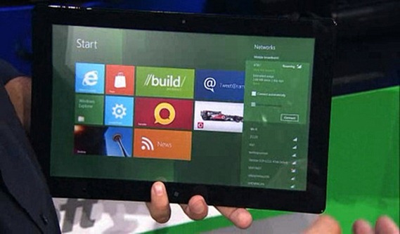
Metro style apps

This is important information. It means WinRT can only be used for developing metro style apps. Metro style apps, although perfectly legal on a desktop system, are especially meant for tablets. This is the environment where they truly shine! And tablets are the most important reason Microsoft has actually created it. Why ? How else would they provided fast and fluid user experience on an ARM based tabled cloacked at 1.6 GHz ? Would you run fully blown WPF apps there ? I doubt. Silverlight ? Better, but you can’t code it with C++. To compete with Apple iPad, they had to provide really fast solution. This is how MS come up with WinRT =)

Let’s have a quick look over the architecture. Oh, don’t be fooled by metro style apps being three times bigger than desktop apps. Microsoft tries very hard to emphasis Metro style Apps, though, as I said, they are mostly meant for tablets, so still most of the LOB applications will be delivered as a standard smart client desktop apps.
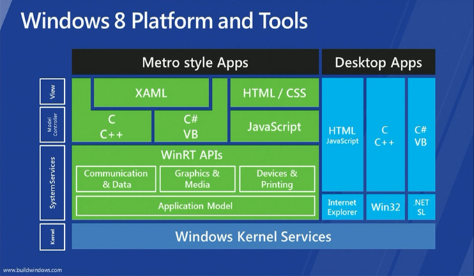
WinRT

From the slide above we clearly see that WinRT is only about Metro style apps. There is also one more thing. For regular Desktop Apps, nothing really changes. So let’s put an end to statements saying that WPF and Silverlight are dead. They’re not! Silverlight 5 is coming out soon, with the RC version already available, and we have WPF 4.5 preview available as well, with cool new feature coming (be sure to check Jonathan Antoine’s blog).

So as I said, it turned out that Silverlight and WPF are still there, they’re all good, and they are XAML based. As you see, the brand new WinRT is also XAML based, so another way of looking at it is that it is yet another manifestation of XAML framework. We have WPF, we have Silverlight, and now we have WinRT.

WinRT has been entirely written in native C++. The did that because they wanted performance, and give the opportunity to C++ devs to build vNext apps for Windows. Besides, Microsoft is constantly saying that the performance is the top priority for them =) What is super important is that WinRT components can be consumed from a variety of languages, including C++, C#, VB, and JavaScript. To enable this scenario, MS baked in a support for metadata, which describes the WinRT objects. As a side note, the metadata uses standard CLR metadata format (ECMA 335), so it can be ILDASMed for instance ;) So each native WinRT component is packed up in a standard native dll, and is accompanied with *.winmd file, which carries all the metadata information for that dll. In the Win8 Developer Preview, all metadata files for standard WinRT dlls are located on C:\Windows\System32\WinMetadata.

As far as the Graphics & Media part is concerned, the framework is a bit similar to Silverligh. UIElement, FrameworkElement, it’s all there. What is different though is the default namespace. We were used to System.Windows.*, now everything is in Windows.*, with the UI part being located in Windows.UI.XAML.* namespace.

That is pretty much it when it comes to WinRT overview, at the end of this post are link to good articles discussing WinRT in more depth.

Why bother writing WinRT components

It comes without surprise that MS allows us to create custom WinRT objects. What’s great about it, is that we can leverage the same metadata system MS is using in the “standard” WinRT, which means we can code our WinRT object in any supported languages (currently C++, C#, VB) and consume it from other languages without any effort. This means we can write performance critical code in C++ and consume it in C#, without resorting to COM interop or P/Invoke. Awesome!

So answering the question, building WinRT components allows developers to share their codebase with other projects, written in any language, targeting any platform. Say you want to develop custom control. If you develop it in C# as a regular CLR dll, you will be able to consume it only in C#. But if you make it a WinRT object, you can leverage it from any Metro app. Okay, so why bother writing such component in C++ then? Because of performance! Do you know why Silverlight is faster than WPF ? Because it’s C++ under the hoods! Don’t believe ? Try reflecting Grid in SL ;)

Summing up this short paragraph, you definitely want to write WinRT component if you want to share you code with other WinRT objects, running on different platforms. And you want to do it in C++ because of the performance.

Writing custom panel in native C++

So finally, we reached to the most interesting part, which is the code. So here I will demonstrate how to develop custom, native WinRT object. To do so, I will use custom panel as an example. Let’s say we want to develop CircularPanel, which layouts all its children in a circle. Let’s begin, shall we ?

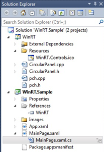
Go to Visual Studio 2011 For Windows 8 Developer Preview, and add new C# empty project. Here we will consume our C++ WinRT object. Now go again and add new project, this time use C++ and WinRT Component template. Delete the WinRTComponent1 source and header files, and add CircularPanel.cpp and CircularPanel.h files. You should have something similar in Solution Explorer.
image

Time to fill in some code! Open up CircularPanel.h file and paste in this code.

#pragma once

using namespace Windows::Foundation;

namespace WinRT
{
namespace Controls
{
public ref class CircularPanel sealed : public Windows::UI::Xaml::Controls::Panel
{
private:
float _maxChildHeight;
float _maxChildWidth;

public:
CircularPanel ();
~CircularPanel ();

protected:
virtual Size ArrangeOverride(Size finalSize) override;

virtual Size MeasureOverride(Size availableSize) override;
};
}
}


As you can see no rocket science there. We define our CircularPanel class as ref so that it will act as a reference type, and we derive it from Windows.UI.Xaml.Controls.Panel class. Please note we declare MeasureOverride and ArrangeOverride methods that we will override to provide panel’s functionality. Now let’s go to the pane source.


// CircularPanel.cpp

#include "pch.h"
#include "CircularPanel.h"
#include "math.h"

#define PI 3.1415926

using namespace WinRT::Controls;
using namespace Windows::UI::Xaml;
using namespace Windows::UI::Xaml::Controls;

float Max(float x, float y)
{
if (x > y) return x;

return y;
}

float Min(float x, float y)
{
if (x > y) return y;

return x;
}

CircularPanel::CircularPanel ()
{
}

CircularPanel::~CircularPanel ()
{
}

Size CircularPanel::ArrangeOverride(Size finalSize)
{
Point centerPoint = Point();
centerPoint.X = finalSize.Width / 2;
centerPoint.Y = finalSize.Height / 2;

float radius = Min(centerPoint.X, centerPoint.Y) - (_maxChildWidth + _maxChildHeight) / 4;
float degreesPerChild = 360.0 / Children->Size;
float currentDegree = 0;

for (int i = 0; i < Children->Size; i++)
{
UIElement^ element = Children->GetAt(i);
float x = centerPoint.X + radius * cos(currentDegree * PI / 180);
float y = centerPoint.Y + radius * sin(currentDegree * PI / 180);

Rect rect = Rect();
rect.X = x - element->DesiredSize.Width / 2;
rect.Y = y - element->DesiredSize.Height / 2;
rect.Width = element->DesiredSize.Width;
rect.Height = element->DesiredSize.Height;

// Arrange child element
element->Arrange(rect);

currentDegree += degreesPerChild;
}

return finalSize;
}

Size CircularPanel::MeasureOverride(Size availableSize)
{
for (int i = 0; i < Children->Size; i++)
{
UIElement^ element = Children->GetAt(i);
element->Measure(availableSize);

_maxChildWidth = Max(_maxChildWidth, element->DesiredSize.Width);
_maxChildHeight = Max(_maxChildHeight, element->DesiredSize.Height);
}

return availableSize;
}

There is a little bit of math involved, but rather easy stuff. I don't want to discuss the code itself, just note the syntax. For example, we reference reference types with ^ (like UIElement^). Children collection doesn’t have Count property but Size field instead. Yeah, we’re in C++ world!

Now its time to tell our C# app about our native WinRT project. And this is were troubles start ;) Normally, we would go to Add Reference dialog and add it from Solution projects (no need to manually pick up the assembly), but this feature seems not working right now, although some say it is possible to add C++ WinRT project from Add Reference dialog, just clean the native project before. Didn’t work for me, but who knows, maybe will work for you! So instead go to Add Reference dialog and hit the Browse button. Navigate to the root folder of your solution, go to Debug and select the YourNativeProjectName.winmd file. This is quite interesting step – we reference a native dll using its Windows metadata file. So when you go ahead and compile the solution, you will see… a build error! At least on x64 bit machine.
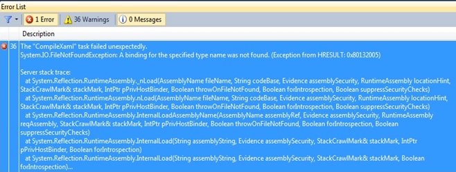


image


I’m not sure if you get exactly the same error, although you should. So the problem is that our native component is targeting Win32 platform, which is x86, but we reference it from Any CPU C# project. This won’t work. Go to Configuration Manager and change C# project to target x86.
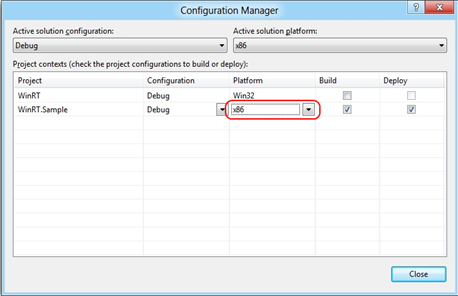


image


So now if you go ahead and compile, you will get another error.


image


This one is also easy to fix. So our component uses Platform.IDisposable, which needs to be referenced. So go back to Add Reference dialog and add Microsoft.VCLib dependency. Now the compilation should succeed.


So since the compilation succeeded, let’s actually make use of our WinRT object. But there is yet another gotcha! For unknown reason, I couldn’t get this panel to work in XAML. I got compile error saying this component is unknown. Referencing it from code worked, however.


partial class MainPage
{
public MainPage()
{
InitializeComponent();

Loaded += new RoutedEventHandler(MainPage_Loaded);
}

private void MainPage_Loaded(object sender, RoutedEventArgs e)
{
CircularPanel panel = new CircularPanel();

panel.Children.Add(new Button() { Content = "1", Width = 100, Height = 100 });
panel.Children.Add(new Button() { Content = "2", Width = 100, Height = 100 });
panel.Children.Add(new Button() { Content = "3", Width = 100, Height = 100 });
panel.Children.Add(new Button() { Content = "4", Width = 100, Height = 100 });
panel.Children.Add(new Button() { Content = "5", Width = 100, Height = 100 });
panel.Children.Add(new Button() { Content = "6", Width = 100, Height = 100 });
panel.Children.Add(new Button() { Content = "7", Width = 100, Height = 100 });
panel.Children.Add(new Button() { Content = "8", Width = 100, Height = 100 });
panel.Children.Add(new Button() { Content = "9", Width = 100, Height = 100 });

LayoutRoot.Children.Add(panel);
}
}

When you run the app, you should see a couple of buttons arranged in a circle :)


Conclusion


Microsoft did pretty good job with latest Win8. The new metro style apps, though meant for tablets, are truly great. When it comes to development, the Developer Preview is still pretty rough on the edges, but its about a good time to start playing with it, and upgrading skills. When it comes to WinRT development, it feels like WPF/SL.The base concepts like dependency properties, routed events, XAML, it’s all the same! This is a big strength of this platform. Well done MS!


Posts worth reading


A bad picture is worth a thousand long discussions


My thoughts about Build, Windows 8, WinRT, XAML and Silverlight


Welcome to Zombieland, the Metro Style Land of WinRT and the Undead

Win8, Metro Apps and Silverlight


Tuesday, July 26, 2011

Isolating MEF components

What Managed Extensibility Framework does well is component discovery and composition (when saying component I usually refer to MEF part). This is not a big surprise as it was designed to do so. However, one particular area where MEF has nothing to say about is component isolation. What is it ? Component isolation allows for plugins to work together without impacting each other. If one component fails, the rest of the system remains stable as nothing has ever happened. Yes, I know – when designing custom software solutions, we rarely care about plugins (too bad), but about component isolation, we don’t care at all. Why ? Most notably because dealing with component isolation is not an easy task. Since the best way to isolate components is to host them in a separate process, there has to be a fast IPC mechanism, and there is no single address space. Because we have calls across process boundaries, we have to serialize arguments on one side, deserialize them on the other, etc. Quite a bit of work there.

Some of you are probably familiar with System.AddIn namespace, better known as Managed Addin Framework. It has shipped long time ago, in .NET 3.0 if I remember well. This framework provides robust plugin infrastructure, and yes, it supports component isolation on App Domain and Process levels (okay there is also no isolation if you want to leverage plugins only). There is one problem with MAF, though. It has steep learning curve making it hard to jump into it. I never heard someone is using it in a production environment. Alternative ? Haven’t heard about yet. If you had, drop me a line please :)

Recently I have been thinking about creating custom component isolation mechanism and integrating it with Managed Extensibility Framework. Although not that straightforward, I managed to create special, dedicated catalog which can instantiate MEF parts in a separate AppDomain or even a separate process!

Meet the IsolatingCatalog

The IsolatingCatalog is responsible for doing all the magic. It is a decorating catalog, meaning it accepts another catalog, scans all its parts looking for those which need to be isolated, and then instantiates the parts accordingly. The API for the catalog is extremely simple. All you have to do is to tell MEF that a part has to be isolated. To do so, you can use custom export attribute or custom metadata attribute assuming you’re doing the export your way. Here is an example:

[IsolatedExport(typeof(IFakePart), Isolation = IsolationLevel.Process)]
public class FakePart1 : IFakePart
{
}

IsolatedExportAttribute is a custom export attribute which adds some metadata to the exported part, which is interpreted by the IsolatingCatalog so that it knows what to do with the export. The core property is the Isolation property of type IsolationLevel. Not surprisingly, it defines the isolation level for the part :) And the isolation level can be None (mostly used for testing only), AppDomain, and Process. I guess they are self explanatory. As I said, you can also use IsolatedAttribute, which is a custom metadata attribute.

[Export(typeof(IFakePart)), Isolated(Isolation = IsolationLevel.None)]
public class DisposableFakePart1 : IFakePart, IDisposable
{
}

What else can you define for an isolated export ? All properties are specified in the IIsolationMetadata interface which is defined as follows:

public interface IIsolationMetadata
{
/// <summary>
/// Gets the isolation for a part.
/// </summary>
IsolationLevel Isolation { get; }

/// <summary>
/// Indicates if a new host should be created for a new instance of the part.
/// </summary>
bool HostPerInstance { get; }

/// <summary>
/// Gets the name of the isolation group. Used to make sure parts which
/// defined the same name will be hosted in the same activation host.
/// </summary>
string IsolationGroup { get; }
}

With HostPerInstance property you can instruct the runtime to create separate host each time a part is created. I will cover hosts in much more details later on, right now a host is an activation host which, heh, hosts the instance of the created part. And IsolationGroup property is nothing more than a name for the activation host. If two or more parts specify the same name, they will be hosted in the same activation host, be in a separate AppDomain or a process. Note this interface is implemented by both the custom export and custom metadata attribute ensuring you can achieve the same results using either of the approaches.

Last thing to cover, although pretty straightforward, is how to use the catalog itself. As I said, it is a decorating catlog, and there is no philosophy is setting it up:

var typeCatalog = new TypeCatalog(typeof(TempPart), typeof(FakePart1));
var isolatingCatalog = new IsolatingCatalog(typeCatalog);
var container = new CompositionContainer(isolatingCatalog);

var part = container.GetExportedValue<TempPart>();

Let’s stop here for one second, and let’s assume FakePart1 is instantiated in isolation, with TempPart consuming it:

[Export]
public class TempPart
{
[Import]
public IFakePart Part { get; set; }
}

What gets injected into Part property ? If we run this code in debug mode, we would see this:

FakePartProxy

This is very important. What gets injected is a proxy supporting the IFakePart contract rather than a concrete FakePart1 implementation. Why ? Of course because the original FakePart1 is instantiated in isolation, typically in a separate process or AppDomain, so what the client gets is a proxy which serializes all calls to the concrete implementation. Seems obvious, but I wanted to stress it :)

Demo

Now that you have seen how to make isolated parts, it’s time for a little demo. I put a simple app (I took a simple MDI sample from Caliburn project) which displays “movies” from various providers. It shouldn’t be a surprise that each movie provider is a MEF part, and some of them are working properly, and some of them are not.

image

Lets have a quick look at how each provider is exported:

[IsolatedExport(typeof(IMovieProvider), HostPerInstance = true, Isolation = IsolationLevel.Process, IsolationGroup = "SomeName")]
public class Provider1 : IMovieProvider
{
}

You can see that each provider is instantiated in a separate, named activation host. However, because all providers specify the same IsolationGroup, there will be a separate process per each three instances of the providers. Also, the app supports tabbed interface, with each tab getting its own set of providers. This means each tab will have its own process hosting the providers, which can easily be verified in the Task Manager (three tabs above means three processes below):

TaskManager

This mimics the Google Chrome browser approach, where each tab is hosted in a separate process. Okay, lets break something. Provider 3, when executed 2 times, will throw an exception on a separate thread. This is of course by design :) What will happen ? Normally, the application would crush and the process would terminate. However, because the logic which will fail is hosted in a separate process, that process would crush leaving the main app intact. As if this was not enough, the API allows to intercept failures, giving the ability to display error to the user:

image

As you see, even though there was a critical error in one of the providers, the application remains stable. If we go to the Task Manager we will see two processes hosting the providers, as the third one just failed. Btw, make sure you manually copy PluginContainer.exe (this guy can host MEF parts in it) to the bin folder. In feature releases, I will link this assembly directly to IsolatingCatalog.

Lack of features

Although working, this solution is not perfect. One of the drawbacks is that if a developer wants to isolate a part, it has to be exported accordingly. I think it would be nice to have the ability to setup isolation on the import level, so that even though the part developer didn’t plan for isolation, the import side would switch the isolation on. I imagine there would be IsolatedImportAttribute which could do the trick. The other thing is I’m using WCF for IPC. At first it seems okay, but creating WCF host is a costly operation, thus you will notice a slight delay when opening new tabs in the above demo. Perhaps it would be good to craft custom IPC based on named pipes ? Last thing is lack of dependency injection, since we might operate in a different address space. The good news is that it should be possible to address this; WCF supports duplex channel communication on named pipes binding, so I could use proxy to communicate back with the host application. This is pending on my TODO list :)

Download

Although namespace suggests IsolatingCatalog is part of MefContrib, it is not. It’s not because this is a POC rather than something production ready. I wrote it mainly to prove it is possible to isolate MEF parts. Having said that, I think the approach chosen is good (inproc WCF with named pipes binding is used for the IPC purposes), and I would love to see this being part of MefContrib someday. The only thing is time needed to add more test cases, doing a cleanup, etc. If you feel you could help me with that, drop me a line and we can work together!

To download the IsolatingCatalog, just go to my MefContrib fork and download isolation branch. The demo presented above can be downloaded from my skydrive below.


Conclusion

This post covered a working solution which enables to activate MEF parts in a separate AppDomain or even a separate process. Next post will cover how the isolation is being handled by IsolatingCatalog. Although not yet completed, my approach seems working fine, and after extensive testing I think it will make its way to the MefContrib. In the meantime, if you feel you could contribute to that catalog, either from MEF or isolation perspectives, fell free to contact me so that we might exchange ideas, etc. Hope you liked it!

Saturday, April 9, 2011

Introducing convention based programming for Managed Extensibility Framework

More than a year ago my friend @TheCodeJunkie wrote a very nice addition to Managed Extensibility Framework – the ConventionCatalog. Since then it’s a part of MefContrib project. However, I haven’t seen many people using it. My guess is that there is no much information about it, besides this post. So in this post I will discuss what a convention model is, and how to use it!

What is ConventionCatalog ?

Convention model (aka. ConventionCatalog) allows you to specify conventions to produce parts, exports and imports. Okay, this is all fine, but give me an example! Here is a convention you can define: For every type in assembly MyCompany.MyFantasticProgram, if a type implements IWidget, please export it with contract type IWidget and import property named ViewModel. Nice, huh? Say you have Widget1 and Widget2 classes implementing IWidget interface. image They will be automatically exported, and moreover, they don’t have to be attributed using standard MEF attributes!!! This is because the ConventionCatalog defines an extensible mechanism for writing such conventions! And you can write your own easily! One thing to note about the above convention – it will be applied to many types, particularly all implementing the IWidget interface. This is important as you don’t have to explicitly export all the classes individually. At the same time, it is perfectly legal to apply a convention to a single type. Example? If you ever encounter Widget123 type, please export it using IWidget contract type and add Location metadata with a value of Location.Left (enumeration). Here, only a single class (part) will be affected – the Widget123 class. Now you have a pretty good understanding what conventions are in the beautiful world of MEF, but how can I specify them in a program ? So as I stated previously, the catalog is extensible, so.. any possible way of specifying the conventions is… possible! Originally, @TheCodeJunkie developed a pretty nice fluent interface for defining them (as part of MefContrib 1.1 I’ve added some extension methods to ease the use of fi). Here is a code which defines the initial convention (it does not specify where to look for the types to apply it – be patient)

Part()
.ForTypesAssignableFrom<IWidget>()
.ExportAs<IWidget>()
.ImportProperty("ViewModel");


Recently, I have developed a registration mechanism which enables to specify parts via the configuration file – App.config. Next section outlines both methods using a simple use case.


How can I use it ?


Let’s begin with a simple scenario. Let’s build a console application which can display a list of movies from various data sources. Here are the main classes and interfaces involved in the design: MovieClasses The core interface is IMovieProvider which provides an abstraction over any movie repository and has only one method returning a list of movies from a single movie source. It also has two dummy implementations – nothing interesting. This interface is consumed by the MovieLister class which implements IMovieLister and acts as a facade on top of the providers. It simply returns all movies from all providers available, with optional filtering by movie title. MovieLister also performs some simple logging, and the logger is injected using the constructor injection. The complete code for that class is right here:


public class MovieLister : IMovieLister
{
private readonly ILogger _logger;

public MovieLister(ILogger logger)
{
_logger = logger;
}

public IMovieProvider[] Providers { get; set; }

public IEnumerable<Movie> GetMovies()
{
var movies = Providers
.SelectMany(movieProvider => movieProvider.GetMovies())
.ToList();

_logger.Log(string.Format("Loaded {0} movies.", movies.Count));

return movies;
}

public IEnumerable<Movie> GetMoviesByName(string name)
{
var movies = GetMovies()
.Where(m => m.Name.Contains(name))
.ToList();

_logger.Log(string.Format("Found {0} movies matching '{1}'.", movies.Count, name));

return movies;
}
}

Note that there is no sign of standard MEF Export/Import attributes, and the constructor is not attributed with ImportingConstructor! Finally, there is a Program class which wraps the app. Here’s the code:

public class Program
{
[Import]
public IMovieLister MovieLister { get; set; }

public static void Main(string[] args)
{
var p = new Program();
p.Init();
p.Run();
}

private void Init()
{
var conventionCatalog = new ConventionCatalog(new MoviePartRegistry());
var container = new CompositionContainer(conventionCatalog);

// Composing this part will inject MovieLister property
container.ComposeParts(this);
}

private void Run()
{
var movies = MovieLister.GetMoviesByName("Movie");
foreach (var movie in movies)
{
Console.WriteLine(movie.Name);
}
}
}

No doubt the most interesting part in the above code is the Init() method. I create there the ConventionCatalog (note this is the only catalog used in this example) and pass an instance of some registry. And here we came to the very important thing: all conventions are defined (or I should rather say can be understood) thanks to the IPartRegistry interface. So to introduce a custom way of defining  conventions, you have to implement that interface (if you want to understand some internals of how ConventionCatalog works, read this post). By default, MefContrib 1.1 ships with two implementations:


  • PartRegistry – this class provides fluent interface to register part/export/import conventions,


  • ConfigurationPartRegistry – this class provide the XML way of specifying conventions.


Okay, so let’s see what it takes to register our parts using fluent interface.

public class MoviePartRegistry : PartRegistry
{
public MoviePartRegistry()
{
// Apply the conventions to all types int the specified assembly
Scan(c => c.Assembly(typeof(Program).Assembly));

Part<MovieLister>()
.MakeShared() // make this part shared
.ExportAs<IMovieLister>() // and export it with contract type IMovieLister
.ImportConstructor() // use constructor injection
.Imports(x =>
{
x.Import<MovieLister>() // import on part MovieLister
.Member(m => m.Providers) // member named 'Providers'
.ContractType<IMovieProvider>(); // with contract type IMovieProvider
});

Part()
.ForTypesAssignableFrom<IMovieProvider>()
.ExportAs<IMovieProvider>();

Part<LoggerImpl>()
.MakeShared()
.ExportAs<ILogger>();
}
}

I derive from PartRegistry (although this is not a requirement, I prefer to do this that way) and do two things there. First, I specify to which types I want to apply my conventions. This is done through a nice lambda expression. What it does under the hoods ? It creates appropriate type scanners. A type scanner (anything implementing ITypeScanner interface) is responsible for returning all the types for which the user wants to assign conventions, if there are any applicable). Out of the box, there are:


  • TypeScanner, which can return user specified types,


  • AssemblyTypeScanner – returns all the types from given assembly,


  • DirectoryTypeScanner – returns all the types from all assemblies from a given disk folder,


  • AggregateTypeScanner – aggregates types from various type scanners.


Does it resemble you something ? Yes! Catalogs from MEF of course! This is because MEF catalogs are responsible for pulling parts/exports/imports from types. Similarly, we obtain types for which we want to apply the conventions. Okay, that’s all in terms of how to specify types for conventions. Lets move on to how to actually specify a convention. There’s a single method called Part() which returns PartConventionBuilder which has a nice fluent API to define part conventions. Part() method comes in two flavours – generic and nongeneric. The difference is that the generic Part<PartType>() method creates a convention in a strongly typed manner and applies that convention only to the part type specified as a generic type argument. However, if you want to leverage strong typing and specify conventions for other types as well, you can force it using ForTypesAssignableFrom() method. Actually, to specify types for which you want to apply the convention, you can use any of the For*() methods. It would be pointless to further explain the API, please play with it and let us know how does it feel – we can always improve! You probably have noticed how nicely IMoveProvider instances are exported. But what if we wanted to be able to specify which providers we want to use ? Of course there are many ways of achieving this, including leveraging metadata facilities of MEF. One method could also be to specify movie providers in the App.config file rather than exporting all IMovieProvider implementations using a convention. Let’s explore that possibility.


To configure parts using XML, we need to add another part registry to convention catalog. Change the Init() method to this:

private void Init()
{
var conventionCatalog = new ConventionCatalog(
new ConfigurationPartRegistry("mef.configuration"),
new MoviePartRegistry());
var container = new CompositionContainer(conventionCatalog);

// Composing this part will inject MovieLister property
container.ComposeParts(this);
}

ConfigurationPartRegistry class accepts a string representing the name of the config section used to configure parts. Next, remove the fluent registration for IMovieProviders. Finally, add the App.config with the following content:

<?xml version="1.0" encoding="utf-8" ?>
<configuration>
<configSections>
<section
name="mef.configuration"
type="MefContrib.Hosting.Conventions.Configuration.Section.ConventionConfigurationSection, MefContrib" />
</configSections>

<mef.configuration>
<parts>

<part type="ConventionCatalogDemo.MovieProvider1, ConventionCatalogDemo" creationPolicy="Shared">
<exports>
<export contractType="ConventionCatalogDemo.IMovieProvider, ConventionCatalogDemo" />
</exports>
</part>

<part type="ConventionCatalogDemo.MovieProvider2, ConventionCatalogDemo" creationPolicy="Shared">
<exports>
<export contractType="ConventionCatalogDemo.IMovieProvider, ConventionCatalogDemo" />
</exports>
</part>

</parts>
</mef.configuration>

</configuration>

Well, what do we have in here ? :) We have a MEF configuration specifying a set of parts. Each part must have a full .NET type associated with it (type name + assembly). The part (not surprisingly) can have a set of exports it offers and of course a set of imports it consumes. Each export can specify:


  • contractType – type of the contract,


  • contractName – name under which the export will be available,


  • member – name of the member of the part to export (leave empty to export the whole part itself),


  • metadata – a collection of metadata-items specifying metadata that will be attached to the export.


Each import can specify:


  • contractType – type of the contract,


  • contractName – name used to resolve the import,


  • member – name of the member of the part to import,


  • creationPolicy – required creation policy,


  • allowDefault – whether the import allow default values,


  • isRecomposable – whether the import is recomposable,


  • required-metadata – a collection of metadata-items specifying required metadata.


To specify a set of imports for a part use imports xml element and fill it with import xml elements. I guess everything is self explanatory. If you have any doubts, pleas see MefContrib.Tests project to see some more examples.


Where can I find it ?


ConventionCatalog discussed in this post is available in MefContrib project. New ConfigurationPartRegistry ships as part of the MefCotrinb 1.1. Please download sources and binaries from mefcontrib.com. Sample code used in this post can be downloaded here. There is also another sample application (WPF based), which shows how ConventionCatalog can be used. You can download it from our official MefContrib-Samples Github repository. Here’s the screenshot for that app: ExtensibleDashboardOnConventions Enjoy and let me know if you like it!

Tuesday, March 29, 2011

Integrating Castle Windsor with MEF

Some time ago I developed a small chunk of code which enabled Unity and Managed Extensibility Framework to consume each others components (see my posts here and here). After a while I hooked up with @TheCodeJunkie who was, and still is, responsible for managing MefContrib project, which aims at delivering high quality MEF extensions developed by the community. Soon, my integration layer became a part of that library! Yeah, I was excited =) After a while, I posted a refined version. Basically, I extracted some generic code from the existing Unity integration stuff which could be reused with other DI containers. So in this post I want to discuss a simple adapter for Castle Windsor which is built using that infrastructure and enables MEF to consume components registered in Windsor container.

Implementation

All the required stuff lives in MefContrib.Containers namespace (MefContrib.dll assembly) which has been renamed from MefContrib.Integration as the new name is more meaningful. There is one interface and one ExportProvider which are interesting in this scenario. IContainerAdapter is an interface which encapsulates basic behaviour of a typical IoC container. The ContainerExportProvider class then uses that interface to extract relevant components from the IoC and provides them to MEF. So the only part missing from the equation is the actual IContainerAdapter implementation for Windsor Container. Unsurprisingly, it is very simple. Here it comes:

public class WindsorContainerAdapter : ContainerAdapterBase
{
private readonly WindsorContainer _container;

public WindsorContainerAdapter(WindsorContainer container)
{
if (container == null)
{
throw new ArgumentNullException("container");
}

_container = container;
_container.Kernel.ComponentRegistered += ComponentRegisteredHandler;
}

private void ComponentRegisteredHandler(string key, IHandler handler)
{
RegisterCastleComponent(handler);
}

public override object Resolve(Type type, string name)
{
return name == null
? _container.Resolve(type)
: _container.Resolve(name, type);
}

public override void Initialize()
{
var handlers = _container.Kernel.GetAssignableHandlers(typeof (object));
foreach (var handler in handlers)
{
RegisterCastleComponent(handler);
}
}

private void RegisterCastleComponent(IHandler handler)
{
var name = handler.ComponentModel.Name;
var type = handler.Service;

// By default, Windsor assigns implementation's full name for the key,
// but for a default key we want to pass null instead
if (handler.ComponentModel.Implementation.FullName == name)
{
name = null;
}

OnRegisteringComponent(type, name);
}
}


All we have to do is to inform ContainerAdapterBase that a component has been registered within the container so that the ContainerExportProvider knows which types are available. In the Initialize method we have a chance to register components which were registered in the IoC container before the adapter had a chance to intercept this information itself. The Resolve method will be called by MEF in order to get a component from IoC.

Usage

The usage is pretty straightforward. Let’s assume we have IFoo service which maps to Foo implementation. Here’s the code which registers these types within Castle Windsor and then IFoo is consumed by MEF.

var windsorContainer = new WindsorContainer();
var provider = new ContainerExportProvider(new WindsorContainerAdapter(windsorContainer));
var compositionContainer = new CompositionContainer(provider);

// Setup Castle Windsor
windsorContainer.Register(Component.For<IFoo>().ImplementedBy<Foo>());

var fooExport = compositionContainer.GetExport<IFoo>();

Of course, named registration is supported. Also MEF can resolve all IFoo implementations if it happens that IFoo is mapped to more than one implementation (thanks to named registration). See all the tests available in the provided solution. 

Where can I find this ?

This code with some NUnit tests is available as a sample for the MefContrib project. You can find its sources at https://github.com/MefContrib/MefContrib-Samples.

Enjoy!

Tuesday, March 22, 2011

Geeks On Tour – Me speaking about MEF/MefContrib / Extensibility

3rd-Geeks-on-Tour logo

I’m happy to announce that between April 18th and 20th 2011 I will be speaking on Geeks on Tour roadshow! Three days, three cities – Katowice, Wrocław, Poznań, two presentations each day. Wondering what MEF is ? How does it relate to IoC and Managed Addin Framework ? When to choose which ? What’s MefContrib and how it can help you ? How to write your custom MEF extensions ? Join me on the talks to find out this and many more! You can find more details about the event, including detailed agenda, on geeksontour.pl official page!

I will be covering all the aspects regarding MEF, its strong and week sides, how does MEF relate to other technologies. I will be showing some of the cool features MEF team is preparing as part of MEF 2 release. I will show some cool features which are part of MefContrib project. Finally, I will deep dive into MEF internals, I will show how to write custom exporters and catalogs. The presentations will be held in Polish. Entrance is free :) See you there!

Presentation and full source code is available below.