In this post I will discuss how to build a TransitionControl, which beautifully animates transitions from one visual state into the other. To demonstrate the effect, I updated my wizard demo (discussed here and here) so that transitions between consecutive steps are nicely animated. I will also show what it takes to add transition effect to regular TabControl. The following screens show the slide transition between two wizard steps.

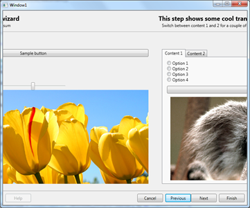

And the following shows a transition within TabControl.


Pixel shader libraries
Pixel shaders were introduced in .NET Framework 3.5 SP1. By this time, Microsoft released really cool library called WPF Effects Library. The library is composed of two types of components: effects and transitions. Effects are successors to well known bitmap effects, and provide a way to alter how a visual is rendered on the screen (see this video). Transitions, on the other hand, provide a means to.. transition from one visual state to the other. Easy, huh ? We will leverage them to build robust TransitionControl.
These days the project seems not to be much updated, the latest version is 2.0 beta which targets .NET 3.5, but works with .NET 4.0 and Visual Studio 2010. The good news is that although this project is not longer maintained, most of the effects and transitions made its way to Blend 4.0 SDK! They are available in Microsoft.Expression.Effects.dll assembly.
Okay, so I introduced transitions, just show how to use them and probably we’re done here, right ? it turns out we’re not quite done here. Lets see what is the API for using a transition effect. The base TransitionEffect class, from which all transitions derive, is located in Microsoft.Expression.Interactions.dll assembly, and its public API is defined as follows:
public abstract class TransitionEffect : ShaderEffect
{
    protected TransitionEffect();
    public Brush Input { get; set; }
    public Brush OldImage { get; set; }
    public double Progress { get; set; }
}
The class inherits ShaderEffect, which makes it essentially a regular pixel shader effect. So it can be assigned to the Effect property of any UIElement. There are also two important properties: OldImage and Progress. The OldImage brush defines the look of the old visual, and the Progress, between 0.0 and 1.0, denotes where we are within the transition. So the flow when using any TransitionEffect is as follows:- Choose any transition effect and apply it to any UIElement which is the target visual we want to transition to
- Get the VisualBrush which depicts the visual we transition from, and assign it to the OldImage property
- Animate Progress property from 0.0 to 1.0 to perform the actual transition
Meet the TransitionControl
TransitionControl encapsulates the above three steps and provides a nice API to consume by the client. Let’s think for a moment, what is the most convenient API for the TransitionControl ? Yes, you’re right, it’s a ContentControl! ContentControl provides a Content property which is almost everything we care about. Whenever we change the Content property to something else, we expect to get a nice transition which smoothly goes from one visual state to the other. Having said that, let’s see the API of the TransitionControl.
public class TransitionControl : ContentControl
{
    public TransitionSelector ContentTransitionSelector { get; set; }

    public TimeSpan Duration { get; set; }

    public IEasingFunction EasingFunction { get; set; }

    public bool EnableTransitions { get; set; }
}
You can see that the TransitionControl is essentially a ContentControl. This is good, because, whenever you use ContentControl, you can swap it for TransitionControl and get the transitions for free! The second important thing is how actually TransitionControl knows about particular transition we want to use ? This is where TransitionSelector comes in. It is an abstract class which behaves similarly to DataTemplateSelector. It defines single method as show below.public abstract class TransitionSelector
{
public abstract TransitionEffect GetTransition(object oldContent, object newContent, DependencyObject container);
}
You implement this class and hand over a new instance to TransitionControl. You get both the old and new contents, so it is possible to write dynamic logic which selects transition based on a content. Nice, huh ? There are also two properties which drive the behavior of the transition. Duration determines the length of the transition, and EasingFunction allows to supply easing function :)How does it work ?
The transition kicks of when the Content property changes. If the previous content was empty, of course no transition occurs. But if both old and new contents are presents, transition is triggered. The “magic” sits in the AnimateContent method, which is responsible for going through the three steps outlined previously.
private void AnimateContent(object oldContent, object newContent)
{
    var oldContentVisual = GetVisualChild();
    var tier = (RenderCapability.Tier >> 16);

    // if we dont have a selector, or the visual content is not a FE, do not animate
    if (EnableTransitions == false || ContentTransitionSelector == null || oldContentVisual == null || tier < 2)
    {
        SetNonVisualChild(newContent);
        return;
    }

    // create the transition
    TransitionEffect transitionEffect = ContentTransitionSelector.GetTransition(oldContent, newContent, this);
    if (transitionEffect == null)
    {
        throw new InvalidOperationException("Returned transition effect is null.");
    }

    // create the animation
    DoubleAnimation da = new DoubleAnimation(0.0, 1.0, new Duration(Duration), FillBehavior.HoldEnd);
    da.Completed += delegate
    {
        ApplyEffect(null);
    };
    if (EasingFunction != null)
    {
        da.EasingFunction = EasingFunction;
    }
    else
    {
        da.AccelerationRatio = 0.5;
        da.DecelerationRatio = 0.5;
    }
    transitionEffect.BeginAnimation(TransitionEffect.ProgressProperty, da);

    // create the visual brush which is the source of the "old content" image
    VisualBrush oldVisualBrush = new VisualBrush(oldContentVisual);
    transitionEffect.OldImage = oldVisualBrush;

    SetNonVisualChild(newContent);
    ApplyEffect(transitionEffect);
}
How to make transition aware TabControl
This task is super easy task! Just extract the default template for TabControl, and remove ContentPresenter with name PART_SelectedContentHost and provide the following XAML.
<Controls:TransitionControl
  x:Name="PART_SelectedContentHost"
  Duration="00:00:01"
  Content="{TemplateBinding SelectedContent}"
  ContentTransitionSelector="{StaticResource TabControlTransitionSelectorKey}"
  Margin="{TemplateBinding Padding}" SnapsToDevicePixels="{TemplateBinding SnapsToDevicePixels}"/>
You will have to supply proper TransitionSelector. In the demo application, I used the following:
public class TabControlTransitionSelector : TransitionSelector
{
    private readonly Random _random = new Random();

    private readonly TransitionEffect[] _transitions = new TransitionEffect[]
    {
        new SmoothSwirlGridTransitionEffect(),
        new BlindsTransitionEffect(),
        new CircleRevealTransitionEffect(),
        new CloudRevealTransitionEffect(),
        new FadeTransitionEffect(),
        new PixelateTransitionEffect(),
        new RadialBlurTransitionEffect(),
        new RippleTransitionEffect(),
        new WaveTransitionEffect(),
        new WipeTransitionEffect(),
        new SlideInTransitionEffect { SlideDirection = SlideDirection.TopToBottom }
    };
    public override TransitionEffect GetTransition(object oldContent, object newContent, DependencyObject container)
    {
        var index = _random.NextDouble() * _transitions.Length;
        return _transitions[(int) index];
    }
}
Conclusion
In this post I presented how using pixel shader effects create really cool looking, GFX bound transitions. Since the control responsible for wiring up everything is a ContentControl, you can use it wherever you use regular ContentControl, and you will get the transitions for free.
Download
As always, you can download full sources from my Sky Drive.



.png)
