Showing posts with label WPF. Show all posts

Monday, February 27, 2012

Fill up a WPF progress bar with a linear gradient

Not so long ago I was faced with a problem how to fill a rectangle with a gradient, which shows a progress, with the gradient stops depending on the current progress. I know I know, this probably tells you nothing. I believe a good visual example will save me a thousand words, so here it comes. This is what I wanted to say:
imageimageimage
So lets discuss what we see here. We have three styled progress bars, each filled with the same background. The middle one serves as a reference point only. The middle and the last text boxes are filled with a regular linear gradient brush. And I mean regular, absolutely no magic there. When we change the progress using the slider, you can see that the rectangle which is used to show current progress shrinks or expands, but the last gradient behaves in a weird way. This is actually the default bahavior here. However, what I really expect is the behavior of the first progress bar – the fill gradient depends on the current progress. In other words, you can imagine 100% as the full gradient. Than, I want to crop it based on current progress.

So how to write a custom brush which would do that ? Yes, yes, you’re right. It’s not possible. You cannot write custom brushes in WPF. That’s sad but it’s true. No luck ? No! Attached behavior comes to the rescue! Whenever progress changes the attached behavior will recreate LinearGradientBrush and recalculate gradient stops based on the original gradient. It’s actuall simple, let’s have a quick overview of the code itself.

public class LinearGradientBrushBehavior : Behavior<RangeBase>
{
    protected override void OnAttached()
    {            
        AssociatedObject.Loaded += AssociatedObject_Loaded;
        AssociatedObject.ValueChanged += AssociatedObject_ValueChanged;

        var sourceBrush = AssociatedObject.Foreground as LinearGradientBrush;
        if (sourceBrush != null)
        {
            SourceBrush = sourceBrush;
        }
    }
        
    protected override void OnDetaching()
    {
        AssociatedObject.Loaded -= AssociatedObject_Loaded;
        AssociatedObject.ValueChanged -= AssociatedObject_ValueChanged;
    }

    private void AssociatedObject_Loaded(object sender, RoutedEventArgs e)
    {
        CalculateNewGradient(Progress);
    }

    private void AssociatedObject_ValueChanged(object sender, RoutedPropertyChangedEventArgs<double> e)
    {
        CalculateNewGradient(Progress);
    }

    private double Progress
    {
        get { return AssociatedObject.Value / (AssociatedObject.Maximum - AssociatedObject.Minimum); }
    }

    #region SourceBrush

    public LinearGradientBrush SourceBrush
    {
        get { return (LinearGradientBrush)GetValue(SourceBrushProperty); }
        set { SetValue(SourceBrushProperty, value); }
    }

    public static readonly DependencyProperty SourceBrushProperty =
        DependencyProperty.Register(
            "SourceBrush", typeof(LinearGradientBrush), typeof(LinearGradientBrushBehavior), new UIPropertyMetadata(null));

    #endregion
        
    private void CalculateNewGradient(double progress)
    {
        var brush = new LinearGradientBrush();
        brush.StartPoint = SourceBrush.StartPoint;
        brush.EndPoint = SourceBrush.EndPoint;

        foreach (var gradientStop in SourceBrush.GradientStops)
        {
            var offset = (1 - gradientStop.Offset) / progress;
            var newGradientStop = new GradientStop(gradientStop.Color, 1 - offset);
            brush.GradientStops.Add(newGradientStop);
        }

        ApplyNewGradient(brush);
    }

    private void ApplyNewGradient(LinearGradientBrush brush)
    {
        AssociatedObject.Foreground = brush;
    }
}

The most important part is the CalculateNewGradient method, which is called once when the control loads up and each time the progress changes. That method is responsible for calculating new offsets for all gradient stops. Recalculated gradient is than reapplied to the Foreground property. I don’t have to add that rectangle’s Fill is bound to it :) It’s also worth pointing out that this behavior works with RangeBase inherited controls, so you can utilize it to create nice looking Slider!

One thing to consider here is performance. I haven’t noticed any problems, even though each time progress changes, new instance of LinearGradientBrush is created. Which is good :) You can find the sources on my SkyDrive. Hope you like it!

Wednesday, November 2, 2011

WPF transitions using pixel shaders and Blend SDK

WPF transitions are a very nice way to turn standard, boring application interactions into great user experiences, and show the author pays attention to details. There are basically two ways of implementing transitions in WPF. You can do a manual transition using RenderTransform to modify the visuals’ position, scaling and rotation. Throwing in an opacity animation would improve the effect. This option is talked more in-depth here. However, there is a couple of problems with this approach. The biggest issue is that such transitions are CPU bound, since the transition is calculated on the main processor. The other problem is more prosaic – they are relatively hard to implement. The other way is to utilize pixel shaders to blend between two visuals’ images making the illusion of transition. Transitions done this way are GFX bound, offloading the CPU which can perform other useful tasks. Besides, they look just awesome, as you shall see in a moment :) There is a small problem associated with this approach, though. To write custom pixel shader, some GFX knowledge accompanied by HLSL might be required. Crafting nice effect probably would also require a bit of math :) Thankfully, there are some nice libraries packed with effects ready to use! So no worries, we will not be talking math here!
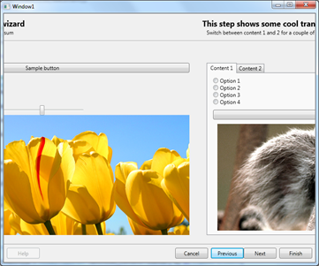
In this post I will discuss how to build a TransitionControl, which beautifully animates transitions from one visual state into the other. To demonstrate the effect, I updated my wizard demo (discussed here and here) so that transitions between consecutive steps are nicely animated. I will also show what it takes to add transition effect to regular TabControl. The following screens show the slide transition between two wizard steps.
imageimageimage
And the following shows a transition within TabControl.
imageimageimage


Pixel shader libraries
Pixel shaders were introduced in .NET Framework 3.5 SP1. By this time, Microsoft released really cool library called WPF Effects Library. The library is composed of two types of components: effects and transitions. Effects are successors to well known bitmap effects, and provide a way to alter how a visual is rendered on the screen (see this video). Transitions, on the other hand, provide a means to.. transition from one visual state to the other. Easy, huh ? We will leverage them to build robust TransitionControl.
These days the project seems not to be much updated, the latest version is 2.0 beta which targets .NET 3.5, but works with .NET 4.0 and Visual Studio 2010. The good news is that although this project is not longer maintained, most of the effects and transitions made its way to Blend 4.0 SDK! They are available in Microsoft.Expression.Effects.dll assembly.
Okay, so I introduced transitions, just show how to use them and probably we’re done here, right ? it turns out we’re not quite done here. Lets see what is the API for using a transition effect. The base TransitionEffect class, from which all transitions derive, is located in Microsoft.Expression.Interactions.dll assembly, and its public API is defined as follows:
public abstract class TransitionEffect : ShaderEffect
{
    protected TransitionEffect();
    public Brush Input { get; set; }
    public Brush OldImage { get; set; }
    public double Progress { get; set; }
}
The class inherits ShaderEffect, which makes it essentially a regular pixel shader effect. So it can be assigned to the Effect property of any UIElement. There are also two important properties: OldImage and Progress. The OldImage brush defines the look of the old visual, and the Progress, between 0.0 and 1.0, denotes where we are within the transition. So the flow when using any TransitionEffect is as follows:
  1. Choose any transition effect and apply it to any UIElement which is the target visual we want to transition to
  2. Get the VisualBrush which depicts the visual we transition from, and assign it to the OldImage property
  3. Animate Progress property from 0.0 to 1.0 to perform the actual transition
As you can see, this is not very complicated, but far from being convenient. And this is where TransitionControl comes to play (I believe Telerik offers similar control).


Meet the TransitionControl
TransitionControl encapsulates the above three steps and provides a nice API to consume by the client. Let’s think for a moment, what is the most convenient API for the TransitionControl ? Yes, you’re right, it’s a ContentControl! ContentControl provides a Content property which is almost everything we care about. Whenever we change the Content property to something else, we expect to get a nice transition which smoothly goes from one visual state to the other. Having said that, let’s see the API of the TransitionControl.
public class TransitionControl : ContentControl
{    
    public TransitionSelector ContentTransitionSelector { get; set; }
    
    public TimeSpan Duration { get; set; }

    public IEasingFunction EasingFunction { get; set; }

    public bool EnableTransitions { get; set; }       
}
You can see that the TransitionControl is essentially a ContentControl. This is good, because, whenever you use ContentControl, you can swap it for TransitionControl and get the transitions for free! The second important thing is how actually TransitionControl knows about particular transition we want to use ? This is where TransitionSelector comes in. It is an abstract class which behaves similarly to DataTemplateSelector. It defines single method as show below.
public abstract class TransitionSelector
{
    public abstract TransitionEffect GetTransition(object oldContent, object newContent, DependencyObject container);
}
You implement this class and hand over a new instance to TransitionControl. You get both the old and new contents, so it is possible to write dynamic logic which selects transition based on a content. Nice, huh ? There are also two properties which drive the behavior of the transition. Duration determines the length of the transition, and EasingFunction allows to supply easing function :)


How does it work ?
The transition kicks of when the Content property changes. If the previous content was empty, of course no transition occurs. But if both old and new contents are presents, transition is triggered. The “magic” sits in the AnimateContent method, which is responsible for going through the three steps outlined previously.
private void AnimateContent(object oldContent, object newContent)
{
    var oldContentVisual = GetVisualChild();
    var tier = (RenderCapability.Tier >> 16);

    // if we dont have a selector, or the visual content is not a FE, do not animate
    if (EnableTransitions == false || ContentTransitionSelector == null || oldContentVisual == null || tier < 2)
    {
        SetNonVisualChild(newContent);
        return;
    }
    
    // create the transition
    TransitionEffect transitionEffect = ContentTransitionSelector.GetTransition(oldContent, newContent, this);
    if (transitionEffect == null)
    {
        throw new InvalidOperationException("Returned transition effect is null.");
    }

    // create the animation
    DoubleAnimation da = new DoubleAnimation(0.0, 1.0, new Duration(Duration), FillBehavior.HoldEnd);
    da.Completed += delegate
    {
        ApplyEffect(null);
    };
    if (EasingFunction != null)
    {
        da.EasingFunction = EasingFunction;
    }
    else
    {
        da.AccelerationRatio = 0.5;
        da.DecelerationRatio = 0.5;
    }
    transitionEffect.BeginAnimation(TransitionEffect.ProgressProperty, da);

    // create the visual brush which is the source of the "old content" image
    VisualBrush oldVisualBrush = new VisualBrush(oldContentVisual);
    transitionEffect.OldImage = oldVisualBrush;

    SetNonVisualChild(newContent);
    ApplyEffect(transitionEffect);
}


How to make transition aware TabControl
This task is super easy task! Just extract the default template for TabControl, and remove ContentPresenter with name PART_SelectedContentHost and provide the following XAML.
<Controls:TransitionControl 
  x:Name="PART_SelectedContentHost"
  Duration="00:00:01"
  Content="{TemplateBinding SelectedContent}"
  ContentTransitionSelector="{StaticResource TabControlTransitionSelectorKey}"
  Margin="{TemplateBinding Padding}" SnapsToDevicePixels="{TemplateBinding SnapsToDevicePixels}"/>

You will have to supply proper TransitionSelector. In the demo application, I used the following:
public class TabControlTransitionSelector : TransitionSelector
{
    private readonly Random _random = new Random();

    private readonly TransitionEffect[] _transitions = new TransitionEffect[]
    {
        new SmoothSwirlGridTransitionEffect(),
        new BlindsTransitionEffect(),
        new CircleRevealTransitionEffect(),
        new CloudRevealTransitionEffect(),
        new FadeTransitionEffect(),
        new PixelateTransitionEffect(),
        new RadialBlurTransitionEffect(),
        new RippleTransitionEffect(),
        new WaveTransitionEffect(),
        new WipeTransitionEffect(),
        new SlideInTransitionEffect { SlideDirection = SlideDirection.TopToBottom }
    };
    public override TransitionEffect GetTransition(object oldContent, object newContent, DependencyObject container)
    {
        var index = _random.NextDouble() * _transitions.Length;
        return _transitions[(int) index];
    }
}


Conclusion
In this post I presented how using pixel shader effects create really cool looking, GFX bound transitions. Since the control responsible for wiring up everything is a ContentControl, you can use it wherever you use regular ContentControl, and you will get the transitions for free.


Download
As always, you can download full sources from my Sky Drive.

Saturday, December 4, 2010

MatrixAnimation for WPF

Windows Presentation Foundation has a powerful animation system. It comes with various classes which enable dependency properties’ values to be animated, i.e. to be automatically changed during a given period of time. WPF supports four types of animations:

  • Linear animation – a value of a property linearly changes from a starting value (referred as From) to a destination value (referred as To).
  • Key frame animation – animation is specified using key frames, each key frame specifies the time and the desired value. The animated property will be assigned once the timeline hits the give time.
  • Path-based animation – property value is given by a geometric path.
  • Frame-based animation – this is the most powerful animation approach, the CompositionTarget class is used to create custom animations based on a per-frame callback.

The first three animation types are supported by <Type>Animation, <Type>AnimationUsingKeyFrames and <Type>AnimationUsingPath classes, respectively. For example, consider the double type. Its animation is supported by DoubleAnimation, DoubleAnimationUsingKeyFrames and DoubleAnimationUsingPath classes.

WPF also supports matrix animations. However, out of the box, only key frame and path-based animations are supported for the Matrix type. This post introduces MatrixAnimation class, which performs linear, smooth animation of the Matrix type. The animation supports translation, scaling and rotation along with easing functions. The following 14 sec-length video shows an early preview of a multi-touch MDI interface whose windows are being animated using the MatrixAnimation class.

The following code snippet represents the MatrixAnimation class.
public class MatrixAnimation : MatrixAnimationBase
{
public Matrix? From
{
set { SetValue(FromProperty, value); }
get { return (Matrix)GetValue(FromProperty); }
}

public static DependencyProperty FromProperty =
DependencyProperty.Register("From", typeof(Matrix?), typeof(MatrixAnimation),
new PropertyMetadata(null));

public Matrix? To
{
set { SetValue(ToProperty, value); }
get { return (Matrix)GetValue(ToProperty); }
}

public static DependencyProperty ToProperty =
DependencyProperty.Register("To", typeof(Matrix?), typeof(MatrixAnimation),
new PropertyMetadata(null));

public IEasingFunction EasingFunction
{
get { return (IEasingFunction)GetValue(EasingFunctionProperty); }
set { SetValue(EasingFunctionProperty, value); }
}

public static readonly DependencyProperty EasingFunctionProperty =
DependencyProperty.Register("EasingFunction", typeof(IEasingFunction), typeof(MatrixAnimation),
new UIPropertyMetadata(null));

public MatrixAnimation()
{
}

public MatrixAnimation(Matrix toValue, Duration duration)
{
To = toValue;
Duration = duration;
}

public MatrixAnimation(Matrix toValue, Duration duration, FillBehavior fillBehavior)
{
To = toValue;
Duration = duration;
FillBehavior = fillBehavior;
}

public MatrixAnimation(Matrix fromValue, Matrix toValue, Duration duration)
{
From = fromValue;
To = toValue;
Duration = duration;
}

public MatrixAnimation(Matrix fromValue, Matrix toValue, Duration duration, FillBehavior fillBehavior)
{
From = fromValue;
To = toValue;
Duration = duration;
FillBehavior = fillBehavior;
}

protected override Freezable CreateInstanceCore()
{
return new MatrixAnimation();
}

protected override Matrix GetCurrentValueCore(Matrix defaultOriginValue, Matrix defaultDestinationValue, AnimationClock animationClock)
{
if (animationClock.CurrentProgress == null)
{
return Matrix.Identity;
}

var normalizedTime = animationClock.CurrentProgress.Value;
if (EasingFunction != null)
{
normalizedTime = EasingFunction.Ease(normalizedTime);
}

var from = From ?? defaultOriginValue;
var to = To ?? defaultDestinationValue;

var newMatrix = new Matrix(
((to.M11 - from.M11) * normalizedTime) + from.M11,
((to.M12 - from.M12) * normalizedTime) + from.M12,
((to.M21 - from.M21) * normalizedTime) + from.M21,
((to.M22 - from.M22) * normalizedTime) + from.M22,
((to.OffsetX - from.OffsetX) * normalizedTime) + from.OffsetX,
((to.OffsetY - from.OffsetY) * normalizedTime) + from.OffsetY);

return newMatrix;
}
}

The code is actually quite simple. The class is derived from the abstract MatrixAnimationBase class. Firstly, three dependency properties are defined, namely From, To and EasingFunction. Next comes a bunch of useful constructors. The interesting part resides in the GetCurrentValueCore method. At first, the current animation time is retrieved. Also, the animation time is eased with the easing function if it is available. Lastly, new matrix is calculated based on the From and To values. Each matrix cell is linearly scaled with the time value. And that’s it! This provides smooth animation for the matrix type!


Thursday, September 2, 2010

Sharp3D – The Beginning

Back when I was on holidays, I’ve read a post by Maciej Aniserowicz about the “Daj się poznać” contest. The aim of the contest is to write an open source project of any kind in any technology, and blog about it at least twice a week, for ten weeks period. There’s also pretty nice collection of software to win. And because a crazy idea is floating in my head for a while, I thought – why don’t give it a try?

So what am I going to create? I’m going to build a research application for manipulating 3D objects, perhaps with the ability to define materials for them, modify existing objects, add new objects to the scene, and render them using custom crafted raytracing algorithm. As if this were not enough, application will fully support multi-touch displays.

Currently, I have a basic skeleton of the application, with my own scene objects (I want to abstract from WPF elements). Here’s the screenshot from the initial drop.

Sharp3D

Motivation

There are a couple of reasons I’m writing this project. By no means, the most important thing for me is to learn strong basics of 3D programming. Triangles, tessellation, normals, materials, lightning, raytracing and more – there is a whole bunch of 3D stuff to master. I also want to learn this in context of WPF 3D – hope this will help me in building better looking apps in the future. I also want to see if the WPF 3D is suitable for project which does more than displaying 3D cubes with buttons on the sides. And last but not least – 3D programming is fun!

Goals

I want Sharp3D to be an extensible foundation for writing 3D applications by others. Thus, the main goal is the extensibility and component design. The application will span several components which can be used in standalone manner – this will support others in developing their own 3D applications! I want to provide many ways of interacting with the 3D model. So besides the standard mouse and keyboard, I will utilize multi-touch capabilities of today’s monitors, and the Wiimote. Because editing capabilities, if any, will be very limited, an important part is to write a loader which will take existing scene and import it to the program. I plan to implement 3ds file importer, because this is de facto the standard in the 3D industry – all known modeling applications support it. Having that, another cool feature will be XAML exporter.

Tools

Because this is a research project, I’m going to use the latest and greatest tools available J This includes:

· .NET Framework 4.0

· Visual Studio 2010

· WPF 4.0

· Blend 4.0

· Git

· Multi-touch / Wiimote

Sources

I decided to use Git which is a fast, distributed version control system. The distributed means that the code repository lives not only on the server (which by the way is not a requirement) but on the user’s computer. This allows committing changes locally, and then pushing them back to the server. When using Git, the natural choice for open source repository is GitHub. The Sharp3D sources can be found at http://github.com/pwlodek/Sharp3D.

There are two important branches. The most important is the master branch. It will contain, latest, stable version. The development will be done on the dev branch. Besides, I will try to use the branch-per-feature approach, which I presume is self-explanatory. After I decide a feature is complete, it will be merged into dev branch, and then into master.

Contribution

If you are interested in contributing to the project – you are more than welcome! Just drop me an email so we can discuss the details. To begin your contribution, register on GitHub and fork the main repo and work on your part. Once ready, issue a pull request – and I will do the rest ;) The one thing is that I won’t pull till the end of the contest as the participants are supposed to work on their own.

Saturday, November 21, 2009

Watermark effect for WPF’s TextBox and ComboBox controls

Update

I have updated this sample to contain the watermark effect for the ComboBox control too. Its implementation is almost identical to the TextBox’s one. Here are the screens showing the effect being applied to the ComboBox control:

image image

And here comes the original post.

In this post I’m going to show a nice watermark effect for WPF’s TextBox control. Sample application (link to the sources at the end of this post) looks as follows:

image image

As you can see, non focused text box containing no text, displays a useful clue to the user informing what kind of information should be entered. Focusing a textbox immediately removes that clue.

There are probably as many ways to introduce such a behavior as there are developers all over the world :) However, one particular solution is to be considered in this case. The above effect has been achieved using adorners. The adorner used for the effect contains a single TextBlock with optional style applied to it. A good introduction to adorners is available here.

The effect has been implemented using attached behavior pattern, so no inheritance was introduced.

Using the behavior is a piece of cake. Here’s how to apply the behavior to a TextBox control:

<TextBox Height="25" Margin="0,5,0,5"
Behaviors:WatermarkTextBoxBehavior.EnableWatermark="True"
Behaviors:WatermarkTextBoxBehavior.Label="Label"
Behaviors:WatermarkTextBoxBehavior.LabelStyle="{StaticResource watermarkLabelStyle2}" />

The first property, EnableWatermark, as its name suggests, enables the effect ;) The Label property holds the text to be displayed as a watermark. Finally, the LabelStyle property contains the style to be applied to the label. And the style, defined in Window’s Resources collection, might look as follows:


<Style x:Key="watermarkLabelStyle">
<Setter Property="TextBlock.Foreground" Value="{x:Static SystemColors.ControlDarkBrush}" />
<Setter Property="FrameworkElement.Opacity" Value="0.8" />
<Setter Property="TextBlock.FontSize" Value="12" />
<Setter Property="TextBlock.FontStyle" Value="Italic" />
<Setter Property="TextBlock.Margin" Value="8,4,4,4" />
</Style>

I’m not going to discuss any implementation details here since the adorner itself is trivial, and the behavior is quite easy as well. Maybe I will tell you that the watermark is displayed when the TextBox fires its Loaded event. Why is that important to know? Keep reading… ;P Besides, skim the code and you immediately know how stuff works :)

Finally, one thing, which deserves to give attention to, is control loading and the adorner layer (adorner layer is a place always rendered over the control where all adorners for that control get displayed). When a control is contained within a portion of UI that is being displayed, but the control itself is not visible, it normally fires Loaded event, but because it is not visible, it has no adorner layer! So don’t assume that call to AdornerLayer.GetAdornerLayer(Visual) always returns the adorner layer! This is why the sample shown above contains a TabControl – the second tab, named Tab 2, contains a TextBox with the watermark effect applied to it, and this still works :)


As always, code sample is available through my Code Gallery here.

Friday, July 10, 2009

Statically Typed Dependency Properties

Recently, I found a nice post written by a friend of mine, regarding statically typed property names. His post can be found here. What I simply did was to put his concept into WPF world :)

Problem

Typical registration of a WPF's dependency property looks like follows:

public int MyInteger1
{
get { return (int)GetValue(MyInteger1Property); }
set { SetValue(MyInteger1Property, value); }
}

public static readonly DependencyProperty MyInteger1Property =
DependencyProperty.Register("MyInteger1", typeof(int), typeof(Window1));

Hmm, what's wrong with it ? It "breakes" the DRY (Don't Repeat Yourself) principle. Given code defines a property named MyInteger of type int, but this information is coded twice, in the property itself and during its registration. If you want to change the name or type of a single property, you have to update the code in two places.

Solution

Now consider the following code:

public int MyInteger2
{
get { return (int)GetValue(MyInteger2Property); }
set { SetValue(MyInteger2Property, value); }
}

public static readonly DependencyProperty MyInteger2Property =
DependencyPropertyHelper.Register<Window1>(t => t.MyInteger2);

What has changed here is the way the property is registered. Now, changing the name or the type of a property is done through its getter. Nice, isn't it ? This approach works with both regular and read only properties but does not with attached properties, because the latter does not use property to access its value but uses methods instead. Implementation behind the Register<TOwner> method used above is fairly simple and looks like this:

public static class DependencyPropertyHelper
{
public static DependencyProperty Register<TOwner>(
Expression<Func<TOwner, object>> property)
{
return DependencyProperty.Register(typeof(TOwner).GetPropertyName(property),
typeof(TOwner).GetPropertyType(property),
typeof(TOwner));
}
}

GetPropertyName and GetPropertyType methods come from the post I've mention at the beginning.

Full code can be downloaded from my code gallery.

Wednesday, June 10, 2009

WPF 3.5 (70-502) Exam Passed

Yesterday, I've successfully completed my first developer's certification by passing exam 70-502 TS: Microsoft .NET Framework 3.5 – Windows Presentation Foundation Application Development. My score was 921 out of 1000 which is also my personal best so far :)
I had 51 question, most of which were single choice, and 150 minutes to complete. Not all the questions were taken into account when computing the final score. Although I've chosen my questions in C#, I got one question in VB, so be prepared ;)

What can you expect from the exam as far as questions are concerned? Putting it simple, everything. Questions cover all the WPF' topics including WPF 3D, ClickOnce deployment, XPS and Flow documents, and Windows Forms interoperability.

As far as WPF 3D is concerned, the questions are rather easy and cover only the basics like cameras or meshes. If you are a novice, I recommend a brief reading about this subject (not because this appears on the exam, but because WPF 3D is a big fun). ClickOnce was heavily covered on the exam, so make sure you get your hands dirty playing with it. Besides basic knowledge, you should know how to download parts of the application on demand (parts which are not required for the application to run). Regarding flow documents, you should know what annotations are, how to manage them, display, persist, etc. Printing both flow and XPS documents is also covered on the exam, so brush up on this subject as well.

In my last words, I want to speak a little about books :) Generally, if you're already familiar with WPF, official Training Kit from MS is mostly sufficient, but it doesn't cover WPF 3D, and some subjects are touched rather briefly. But if you are at the very beginning, or if you simply want to broader you knowledge, I highly recommend picking up Adam Nathan's WPF Unleashed. Actually, if You are serious about WPF development, this book is a must read :)

Wish You good luck!

Monday, April 6, 2009

Parallel Coordinates in WPF - Part 1

A few days ago I have completed working on a first version of a parallel coordinates chart, that has been incorporated into Mammoth Pattern Miner 2009 (see my post about it). Before rolling out my own implementation, I went through the internet trying to find any implementation with the attached source code. As a result, I found a nice post here, but without the sources. Thus, I have developed a nice looking, styleable (via custom control templates) parallel coordinates chart myself :) And despite the fact that I did it under my "company" time, my boss and I decided that it would be great if I posted the sources as well. So I did! :) This is how the diagram looks like:

Overall look and feel of the demo application

This is a first post about PC chart. It covers all the functionality the chart contains, and info about using it from the code. Next posts in this series will cover the chart internals.

Feature List

1. Lines highlighting / selecting and tooltips

1. Axes labels and range labels, helper axis

2. Diagram manipulation
Anytime you resize the window or manipulate the axes, you can fit the diagram to the current view. Simply right click anywhere on the diagram and choose "Fit To Screen" command as shown below.

Besides, you can interact with the diagram using two tools: Select and Grab. If you pick the Select Tool (default), you can select/deselect lines, rotate/swap/move/scale axes. And if you pick the Grab Tool, you can move the diagram. Bear in mind that anytime you manipulate the diagram, you can execute the "Fit To Screen" command to return to the optimal view.

3. Axis scaling / Points Moving

When your mouse is over any axis, you can move the points on it simply by clicking LMB and moving the mouse up and down or you can scale it using the mouse wheel. When the mouse cursor isn't over any axis, using the mouse wheel will scale all the axes. You can scale/move the helper axis as well :)

4. Axis rotating
Axis rotating simply reverses the axis direction. To rotate the axis, move the mouse cursor over it and click the button that will appear at the bottom of the highlighted axis.

5. Axis swapping
You can swap two axes by dragging the source axis (with left CTRL button pressed) and dropping it on the destination axis. After this, the source and the destination axes will swap their placements (see the picture below).

Using the PC chart

Using the chart is very straightforward. First, you need to add the Chart control. This is done in XAML like so:


<Charts:Chart DataSource="{Binding DataSource}" />


Now, you have to prepare the data. Suppose you want to visualize a collection of the following class.


public class DemoInfo
{
public double X { get; set; }
public double Y { get; set; }
public double Z { get; set; }
public double V { get; set; }
public double K { get; set; }
public double M { get; set; }
public int Tag { get; set; }
}
All you have to do is: grab the data, create an appropriate data source, add property to axis mapping, name the labels, and that's it!


public void DataBind()
{
IList<DemoInfo> infos = new List<DemoInfo>();

// Generate random data
for (int i = 0; i < ObjectsCount; i++)
{
var x = new DemoInfo();
x.X = m_Random.NextDouble() * 400 - 100;
x.Y = m_Random.NextDouble() * 500 - 100;
x.Z = m_Random.NextDouble() * 600 - 300;
x.V = m_Random.NextDouble() * 800 - 100;
x.K = 1.0;
x.M = i;
x.Tag = i + 1;

infos.Add(x);
}

// Create the data source and apply mappings
var dataSource = new MultiDimensionalDataSource<DemoInfo>(infos, 6);
dataSource.MapDimension(0, info => info.X);
dataSource.MapDimension(1, info => info.Y);
dataSource.MapDimension(2, info => info.Z);
dataSource.MapDimension(3, info => info.V);
dataSource.MapDimension(4, info => info.K);
dataSource.MapDimension(5, info => info.M);


// Name the labels
dataSource.Labels[0] = "X";
dataSource.Labels[1] = "Y";
dataSource.Labels[2] = "Z";
dataSource.Labels[3] = "V";
dataSource.Labels[4] = "K";
dataSource.Labels[5] = "M";
dataSource.HelperAxisLabel = "Helper axis";

myChart.DataSource = dataSource;
}
Full source code is available here. Note that I use M-V-VM approach :)
Hope you like it!

Tuesday, February 24, 2009

Lack of AttachNewRegion method in Prism 2.0

Today I have switched to Composite WPF and Silverlight 2.0 (known as Prism 2.0) in one of my current projects. The transition was quite smooth (I used a guide which I found here), although I found one issue - the IRegionManager interface does not contain the AttachNewRegion method :( This made me very unhappy because I used this method in the implementation of a IMenuService which is responsible for managing the main menu control within my application by exposing a friendly interface to all modules. After small source code investigation I realized that indeed there's no sign of the mentioned method. After reading interesting post here, I decided to write one myself, which was a trivial task ;) Here's the code:


using System;
using System.Windows;
using Microsoft.Practices.Composite.Presentation.Regions;
using Microsoft.Practices.Composite.Regions;

namespace Mammoth.Presentation.Infrastructure.Common
{
public static class RegionManagerExtensions
{
public static void AttachNewRegion(this IRegionManager regionManager, object regionTarget, string regionName)
{
if (regionManager.Regions.ContainsRegionWithName(regionName))
throw new ArgumentException("Region already exists.", regionName);

RegionManager.SetRegionManager((DependencyObject) regionTarget, regionManager);
RegionManager.SetRegionName((DependencyObject) regionTarget, regionName);
}
}
}


As you can see, this is a very simple extension method that extends the IRegionManger interface. Inside, I simply set the region manager and the region name on the desired UI element.

This solution is very simple, still it works fine (at least for me). If you have any troubles with it, let me know.

Wednesday, February 18, 2009

WPF Wizard Control - Part II

In my previous post about rolling your own WPF wizard control, I've described how one can easily create simple, styleable wizard in WPF. Generally, I blogged that the wizard consists of two things, namely
  • Wizard class - representing the wizard with its buttons (Next, Previous, Finish, etc.) and simple behavior concerned around managing which wizard page should be displayed,
  • WizardPage class - representing a container for a single wizard page.
The first class inherited from the Control class whereas the second inherited from the ContentControl class. Because the Wizard class wasn't derived from any control that can have content, it had to have a bindable collection of wizard's pages. Thus, I brought WizardPagesCollection class into play, which was defined as follows:

    1 
    2     /// 
    3     /// Wizard pages collection.
    4     /// 
    5     public class WizardPagesCollection : ObservableCollection<WizardPage>
    6     {
    7 
    8     }

Besides the collection of pages, the Wizard had two properties, namely
  • ActivePageIndex - the index of the current page in the collection being displayed,
  • ActivePage - the active page itself.
Of course, both properties depends on each other, i.e. if ActivePageIndex changes, ActivePage has to be updated accordingly. This was done using dependency property callbacks. Moreover, I used coerce callbacks to validate the values.
After coding this solution I realized there's a problem with it - the only wizard page that is the part of the wizard's logical tree is the page being displayed! This meant that DataContext property wasn't set correctly, and binding to controls across wizard pages was not possible.

A better Solution

Fortunately, it is very easy to overcome these problems, even without modifying wizard's template! My first assumption about wizard's base class was mistaken, because wizard is indeed a control that should have a content - its own pages :) And because there can be more than one page, the choice is obvious - ItemsControl.

Inheriting from ItemsControl reduced the following code from the Wizard class:

    1 
    2 private WizardPagesCollection m_WizardPages;
    3 
    4 /// 
    5 /// Returns a collection of wizard's pages.
    6 /// 
    7 public WizardPagesCollection WizardPages
    8 {
    9     get { return m_WizardPages; }
   10     set
   11     {
   12         m_WizardPages = value;
   13         m_WizardPages.CollectionChanged += OnWizardPagesChanged;
   14     }
   15 }
   16 
   17 private void OnWizardPagesChanged(object sender, NotifyCollectionChangedEventArgs e)
   18 {
   19     // This code glues all wizard's pages to wizard's DataContext.
   20     // This is done due to the fact that when pages are switched, the
   21     // page that is hidden looses its data context.
   22     foreach (var page in WizardPages)
   23     {
   24         var binding = new Binding("DataContext") { Source = this };
   25         BindingOperations.SetBinding(page, DataContextProperty, binding);
   26     }
   27 }

This was actually the ugly code that attached the value of Wizard's DataContext property to each wizard's page DataContext which eliminated the problem no. 1. And because now wizard contains all the pages within its Items collection (which can be databound via ItemsSource property), all pages appear in the wizard's logical tree. Thus, problems described earlier in this post no more exist :)

Because now I used ItemsControl, I could virtually put anything in the wizard and it will compile. But the wizard expects to contain instances of WizardPage class, so I needed to tell the wizard that it need to wrap any content that is not a WizardPage into an instance of WizardPage. This is done using the following code:

    1 protected override DependencyObject GetContainerForItemOverride()
    2 {
    3     return new WizardPage();
    4 }
    5 
    6 protected override bool IsItemItsOwnContainerOverride(object item)
    7 {
    8     return item is WizardPage;
    9 }

Note, however, that in this solution, both ActivePageIndex and ActivePage properties still play vital role. Also note that there is not a single change in the Wizard's template, which is very simple. The one problem with it is that it defines the "view" for the wizard and for the wizard's page. This will be fixed in the third release :)

I will blog about better approach to implementing custom WPF wizard which fixes the complexity of using the two mentioned properties and uses separate templates for the wizard and its pages in my next post, so stay tuned ;)

The code for this post can be downloaded from here. Note that it actually contains three Wizard's implementations. The one described in this post is contained within WpfWizard2 project. WpfWizard3 will be subject of my next post.

Tuesday, January 27, 2009

Hide a window instead of closing it in WPF

Hiding a window instead of closing it is especially useful when the window is a singleton. This is a typical situation for "options" windows which store application settings. Balaji Ramesh proposed solution to this problem, which can be found here.

    1 
    2 // Handle closing event to hide window instead of closing it
    3 Closing += delegate(object sender, CancelEventArgs e)
    4 {
    5     e.Cancel = true;
    6 
    7     Application.Current.Dispatcher.BeginInvoke(DispatcherPriority.Background, 
    8         (DispatcherOperationCallback)(arg =>
    9     {
   10         Hide();
   11         return null;
   12     }), null);
   13 };

As you can see, the code is extremely simple. Everything it does is to subscribe to Window's Closing event (which is not a routed one), suppress the close action and invoke Window's Hide() method in the UI thread to actually hide the window. We could augment this code with Hiding and Hidden routed events to inform interested entities the window is hiding and when the window is hidden. Using Hiding event it's very easy to cancel window hiding as well.

But what would you do if you had dozens of windows which you would hide instead of close? Typing this code into every window constructor is by no means an option. The neat solution (at least in my opinion) is to implement this functionality as an Attached Behavior.

    1 public static readonly DependencyProperty HideInsteadCloseProperty =
    2     DependencyProperty.RegisterAttached("HideInsteadClose", 
    3     typeof(bool), typeof(WindowBehavior), new FrameworkPropertyMetadata(
    4         new PropertyChangedCallback(OnHideInsteadClose)));
    5 
    6 
    7 private static void OnHideInsteadClose(DependencyObject d,
    8     DependencyPropertyChangedEventArgs e)
    9 {
   10     var window = d as Window;
   11     if (window != null)
   12     {
   13         if ((bool)e.NewValue)
   14         {
   15             // Handle closing event to hide window instead of closing it
   16             window.Closing += delegate(object sender, CancelEventArgs args)
   17             {
   18                 args.Cancel = true;
   19 
   20                 window.Dispatcher.BeginInvoke(DispatcherPriority.Background, 
   21                     (DispatcherOperationCallback)delegate
   22                 {
   23                     var cancelArgs = new CancelRoutedEventArgs(HidingEvent, window);
   24                     window.RaiseEvent(cancelArgs);
   25 
   26                     if (!cancelArgs.Cancel)
   27                     {
   28                         window.Hide();
   29                         window.RaiseEvent(new RoutedEventArgs(HiddenEvent, window)); 
   30                     }
   31 
   32                     return null;
   33                 }, null);
   34             };
   35         }
   36     }
   37 }


The core concept behind the above implementation is to subscribe to the Window's Close event inside HideInsteadClose attached property's change callback. Besides, we can implement Hiding and Hidden attached routed events. (this has been omitted for clarity). Using this code is as simple as adding appropriate code as Window's attribute in XAML as follows:

Common:WindowBehavior.HideInsteadClose="True" Common:WindowBehavior.Hidden="HiddenHandler"


The code is available for download from my Code Gallery here.

Monday, January 19, 2009

Mammoth Pattern Miner - cool WPF application from AGH Department of Computer Science

I'm very excited to announce that a few days ago my university's Department of Computer Science has released the first version of Mammoth Pattern Miner 2009 (MPM), an application I'm currently actively developing (not alone of course :) ). The MPM is a data mining application that is able to analyze large amount of data and discover frequent sets and sequences, partial frequent sets and some user defined patterns. It uses some well known data mining algorithms as well as some custom implementations. Of course, it provides rich visualization capabilities, many filters and extensible application architecture (by the way, which application is not extensible nowadays :P ).

Here are some screen shots from the current release (click image to enlarge it). I'll try to post a video showing the system in action when I have a little free time.

Main view


Visualization and undocked Project Explorer (yes, every window is dockable)


Yet another visualization, tree this time :)

Mammoth Pattern Miner begun as an application that accompanied my master's thesis which has been developed during my stay at UTBM in France in 2008. After I graduated, I was given the opportunity to continue working on this project at my university. To cut the long story short, I simply accepted it.

Now, Mammoth is a mature software product which provides quite big functionality. Nevertheless, there's still much work to do ;)

Just in case you are curious, Mammoth uses Microsoft's .NET Framework 3.5 SP1, WPF and SQL Server 2005. It runs pretty fast on my Lenovo T61p laptop. However, big data sets require lots of ram.

Mammoth official site, for now available in polish only, is located at http://caribou.iisg.agh.edu.pl/proj/mammoth/. If you think you or your work might benefit from using this software, please email me.

Hope you liked it!

Thursday, December 18, 2008

WPF Tips & Tricks Presentation

Yesterday, on Krakowska Grupa Deweloperów .NET, I gave a presentation, together with my friend Arkadiusz Świerczek, on latest Microsoft .NET Framework 3.5 SP1 WPF stuff and WPF Tips & Trick.

We didn't have enough time to cover all the goddies we've prepared, but we managed to introduce some basics around WPF and present WPF effects in pixel shader. Besides, we've presented how to write multi-language, runtime bound UI, skins and a rapid introduction to attached behaviors.

The presentation together with full sources can be downloaded from here. Enjoy!

Saturday, November 29, 2008

patterns & practices: Composite WPF and Silverlight Drop 6

It's been couple of days since I started playing with Prism V2 Drop 6 (You can download it from here). Of course I've been using CompositeWPF aka Prism V1 for a longer time, and I must admin it's an excellent framework, but I wanted to see it's new Silverlight part. Here's what I've found so far.

In general, drop 6 seems working just fine. It contains the following features known from the WPF part:
  • modularity
  • event broker
  • regions
It goes without saying that everything is wired up with P&P Unity 1.2 that also has a port for Silverlight. So if all you need is a good DI container, you can simply grab only the Unity bits from that release.

As I previously said, everything is working fine. One thing disturbs me, however. On the very first version of Prism, I was able to use ordinary classes as views, the view was then defined as a data template. So I could have written something like that:

   47 
   48 var downloadItemPresenter = m_Container.Resolve<NavigationItemPresenter>();
   49 downloadItemPresenter.Text = "Download";
   50 
   51 m_RegionManager.Regions[RegionNames.NavigationPanel].Add(downloadItemPresenter);


In this example, NavigationItemPresenter represents my custom button. However, there is no explicitly given view - the view is defined via data template. Unfortunately, from unknown reasons, this doesn't work in Silverlight. I receive NullPointerException. After "investigation" it turned out that internally, the view is casted to... DependencyObject!!! Why is that?! I don't known. I even tried to extend the DependencyObject class (yes, it's possible despite the fact many people say it's not), but I got other exceptions. To sum up, I use this release in my small project (small page for the product I'm currently working on, I'll post about it as soon as it's finished), but it's a pity that the cool approach with views defined using data templates doesn't work so far. Highly recommended.

Monday, November 10, 2008

WPF Wizard Control - Part I

Writing a custom wizard control (or simply a control of any kind) in many widely used GUI toolkits is usually a challenging task. But it turns out that doing such a control in WPF is rather easy. In this post, I'm going to explain how to create stylable, simple wizard that looks like this:

I recommend briefly examining attached source code before reading the post because the code is not short enough to be pasted on a blog. Still reading "pure" text without the code is far from being nice :)

As you probably know, WPF defines so called look less controls. This means the look and feel of the user controls is completely separated from its behavior. So firstly, I'll go through the wizard's behavior, and at the end I'll explain wizard's style in a few sentences. For now let's only assume that the wizard has navigation buttons such as Next, Previous, Finish, etc., and three places for content: wizard's header, left (side) header and of course a place for displaying main content. Note that I'm not defining yet where these pieces are going to be displayed, for now I only assume they exist somewhere.

The first decision I had to take was the class I needed to inherit from. The options were UserControl or a Control. Because I wanted to give the wizard some styling capabilities (via ComponentResourceKey) and also I wanted it to look more "professional" I decided to inherit from a Control class. There's yet another factor that actually convinced me no to using UserControl. UserControl directly inherits from a ContentControl, and the wizard itself does not have content of any kind! Wizard's content is provided by means of wizard pages and the wizard should display one page at a time. Precisely, wizard will "know" which page it should display (i.e. which page is the current one) and the wizard's template will contain ContentControl that will be databound to the main content of the current page. Of course the same approach will be used for the headers.

As you may have already guessed, single wizard page is represented by WizardPage class. Because it indeed has a content, it directly inherits from ContentControl. And because single WizardPage may provide optional header and side header, it has corresponding dependency properties of type object. Besides, this class defines some other properties like CanXXX which indicate if XXX navigation button is enabled for the page, and PageClose along with PageShow events that are raised whenever a page is closed or shown. As outlined above, the Wizard class contains a collection of WizardPage class.

The Wizard class contains two important dependency properties - ActivePage and ActivePageIndex. I hope their names are self descriptive. Not surprisingly, these two properties depend on each other, i.e. if I change ActivePageIndex, I expect ActivePage will automatically get updated, and vice versa. Moreover, I don't want to receive an error if I accidentally set inappropriate value for these properties. All this can be achieved using change and coerce callbacks. Here's the code:

  225 
  226         private static void OnActivePageIndexChanged(DependencyObject d, DependencyPropertyChangedEventArgs e)
  227         {
  228             Wizard wizard = (Wizard)d;
  229             int index = (int)e.NewValue;
  230             int oldIndex = (int)e.OldValue;
  231 
  232             if (index != -1 && index != oldIndex)
  233                 wizard.ActivePage = wizard.WizardPages[index];
  234             else if (index == -1)
  235                 wizard.ActivePage = null;
  236         }
  237 
  238         private static object CoerceActivePageIndex(DependencyObject d, object value)
  239         {
  240             Wizard wizard = (Wizard)d;
  241             int index = (int)value;
  242 
  243             if (index >= wizard.WizardPages.Count)
  244                 return wizard.WizardPages.Count - 1;
  245 
  246             if (index >= 0 && index < wizard.WizardPages.Count)
  247                 return index;
  248 
  249             if (index < 0 && wizard.WizardPages.Count > 0)
  250                 return 0;
  251 
  252             return -1;
  253         }
  254 
  255         private static void OnActivePageChanged(DependencyObject d, DependencyPropertyChangedEventArgs e)
  256         {
  257             Wizard wizard = (Wizard)d;
  258             WizardPage page = (WizardPage)e.NewValue;
  259             WizardPage oldPage = (WizardPage)e.OldValue;
  260 
  261             if (page != null && oldPage != page)
  262             {
  263                 // Raise event
  264                 if (oldPage != null)
  265                     oldPage.OnPageClose();
  266 
  267                 // update the index
  268                 int index = wizard.WizardPages.IndexOf(page);
  269                 wizard.ActivePageIndex = index;
  270 
  271                 // Set boundary values for navigation buttons
  272                 if (index == 0)
  273                 {
  274                     wizard.ActivePage.CanNavigatePrevious = false;
  275                     if (wizard.WizardPages.Count == 1)
  276                         wizard.ActivePage.CanNavigateNext = false;
  277                 }
  278                 else if (index == wizard.WizardPages.Count - 1)
  279                     wizard.ActivePage.CanNavigateNext = false;
  280 
  281                 // After page is up and runnig, rais event
  282                 page.OnPageShow();
  283             }
  284             else if (page == null)
  285             {
  286                 // Raise event
  287                 if (oldPage != null)
  288                     oldPage.OnPageClose();
  289 
  290                 wizard.ActivePageIndex = -1;
  291             }
  292         }
  293 
  294         private static object CoerceActivePage(DependencyObject d, object value)
  295         {
  296             Wizard wizard = (Wizard)d;
  297             WizardPage page = (WizardPage)value;
  298 
  299             int index = wizard.WizardPages.IndexOf(page);
  300 
  301             // Given page does not exist in the internal collection
  302             if (index == -1)
  303             {
  304                 if (wizard.WizardPages.Count > 0)
  305                     return wizard.WizardPages[0];
  306 
  307                 return null;
  308             }
  309 
  310             return page;
  311         }


OnActivePageChanged callback is especially important, because beside updating ActivePageIndex, it performs two other things. Firstly, it raises two events on a WizardPage class - it raises PageClose event on a page that is about to be replaced, then the page gets replaced and PageShow event is raised on a new page. And secondly, it checks if the current page is first or last in the wizard and enables or disables Next/Previous buttons accordingly.

Wizard's look & feel is defined in Themes\Generic.xaml using simple grid layout. The most important part of the control's template is how actually content of wizard's active page gets displayed in the wizard. This is accomplished using content placeholders in form of ContentControl. There is one problem with this design, however. All wizard's pages except the active one are NOT part of the logical tree as they are simply not displayed. And if the active page gets replaced, it is automatically removed from the visual tree. This implies two things. The first one is that the page's DataContext propertyis not propagated to the parent, i.e. if you put an instance of some class in the window's DataContext and you bind controls inside pages to this instance, this won't work (yes, I'm talking about PresentationModel pattern). The second thing is that you cannot bind controls with each other. Hopefully, there is an easy solution to overcome the first problem:

   44 
   45         /// 
   46         /// Returns a collection of wizard's pages.
   47         /// 
   48         public WizardPagesCollection WizardPages
   49         {
   50             get { return m_WizardPages; }
   51             set
   52             {
   53                 m_WizardPages = value;
   54                 m_WizardPages.CollectionChanged += OnWizardPagesChanged;
   55             }
   56         }

  142 
  143         private void OnWizardPagesChanged(object sender, System.Collections.Specialized.NotifyCollectionChangedEventArgs e)
  144         {
  145             // This code glues all wizard's pages to wizard's DataContext. This is done due to the fact that when pages are switched, the
  146             // page that is hidden looses its data context.
  147             foreach (var page in WizardPages)
  148             {
  149                 var binding = new Binding("DataContext") { Source = this };
  150                 BindingOperations.SetBinding(page, DataContextProperty, binding);
  151             }
  152         }


The second one is still unsolved, but because PresentationModel does work with the wizard, it's not a big deal (Update: to see how to solve these problems, see the second post).

You can download full sample from my Code Gallery.

Have fun!